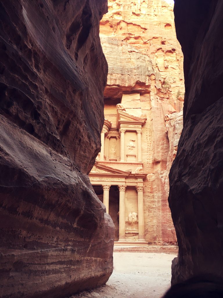
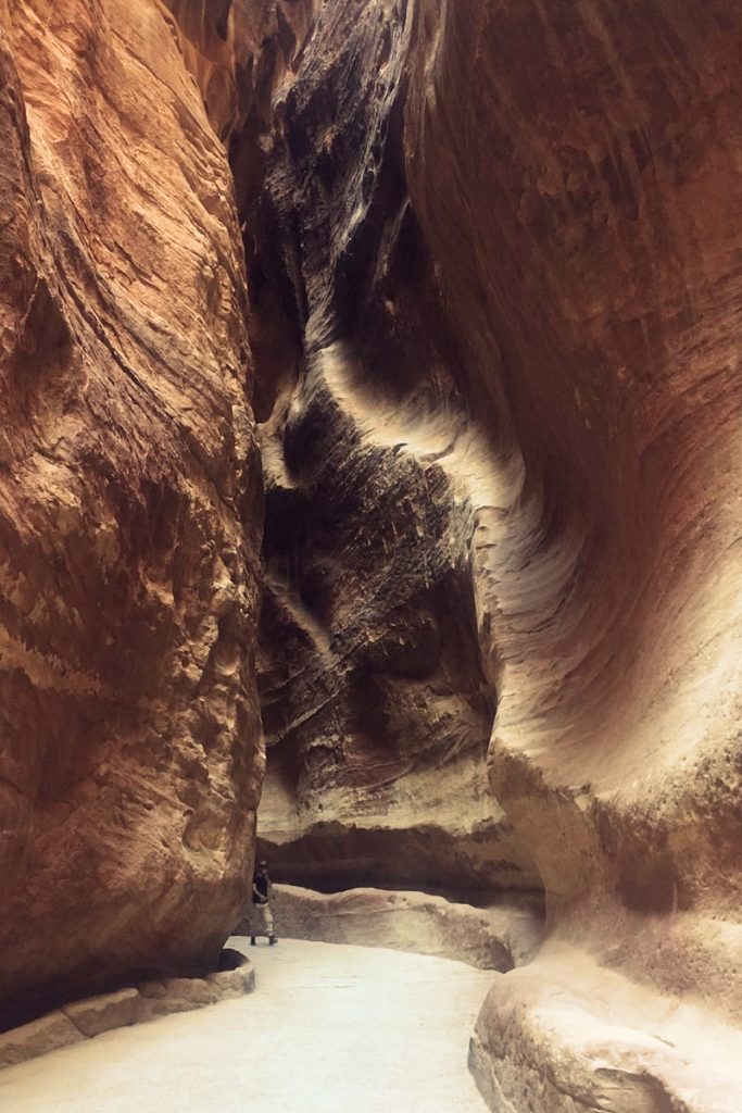
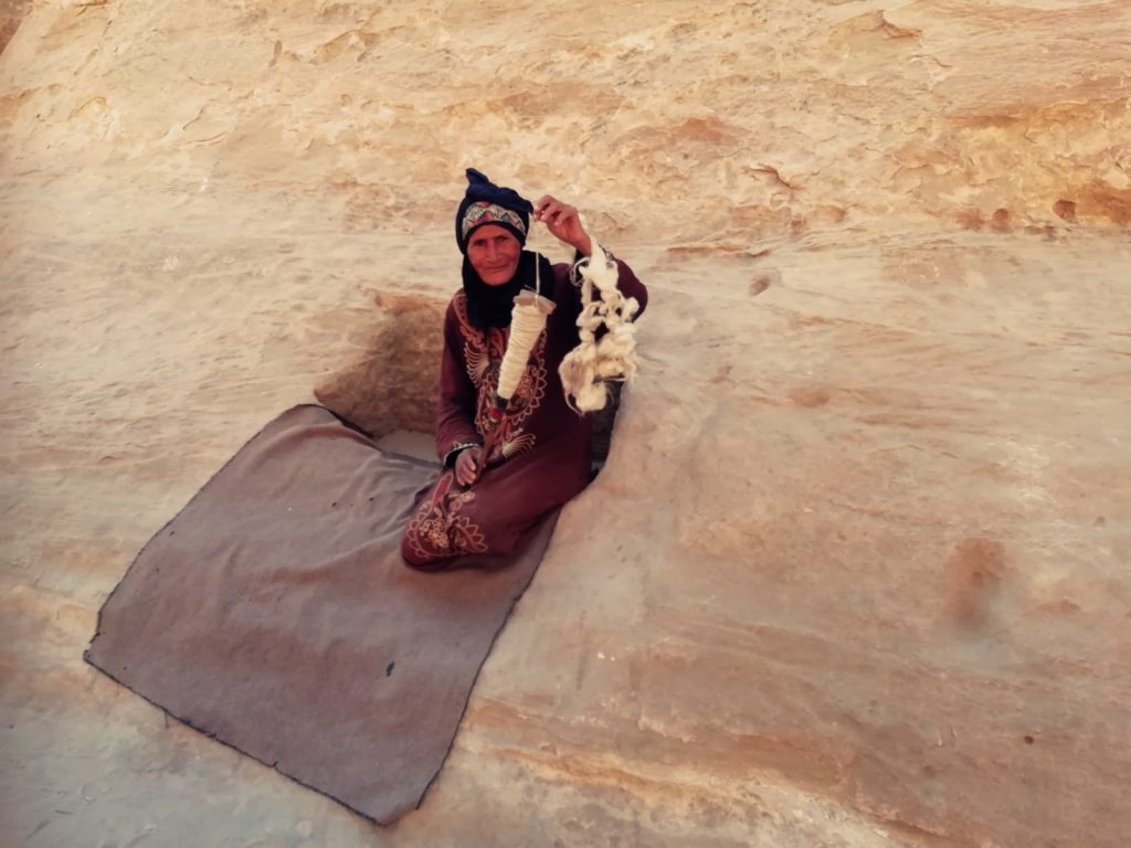
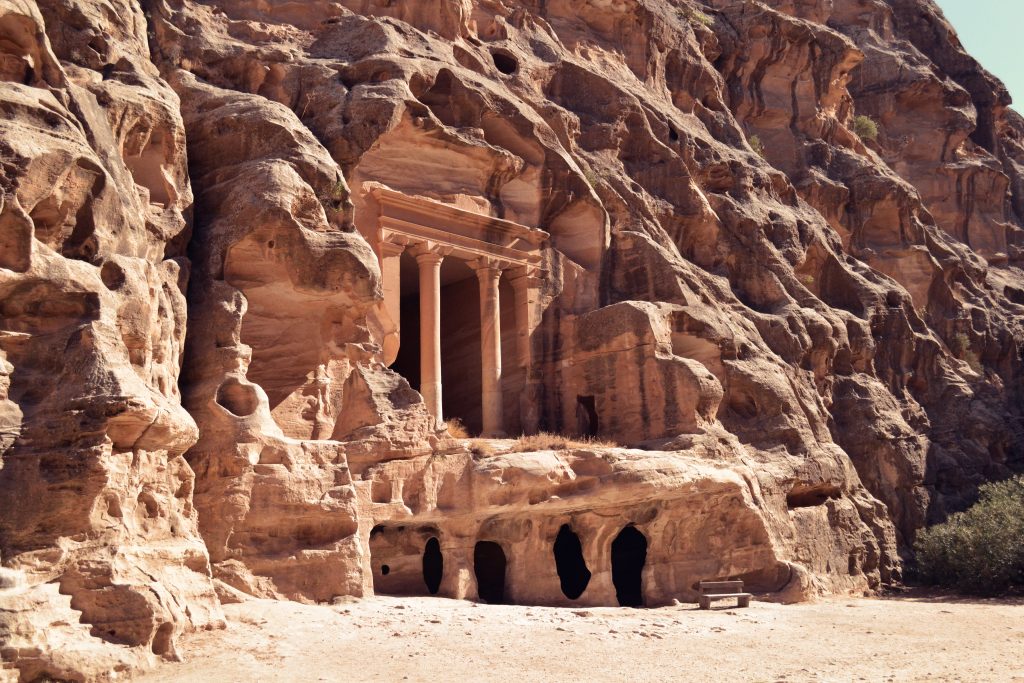
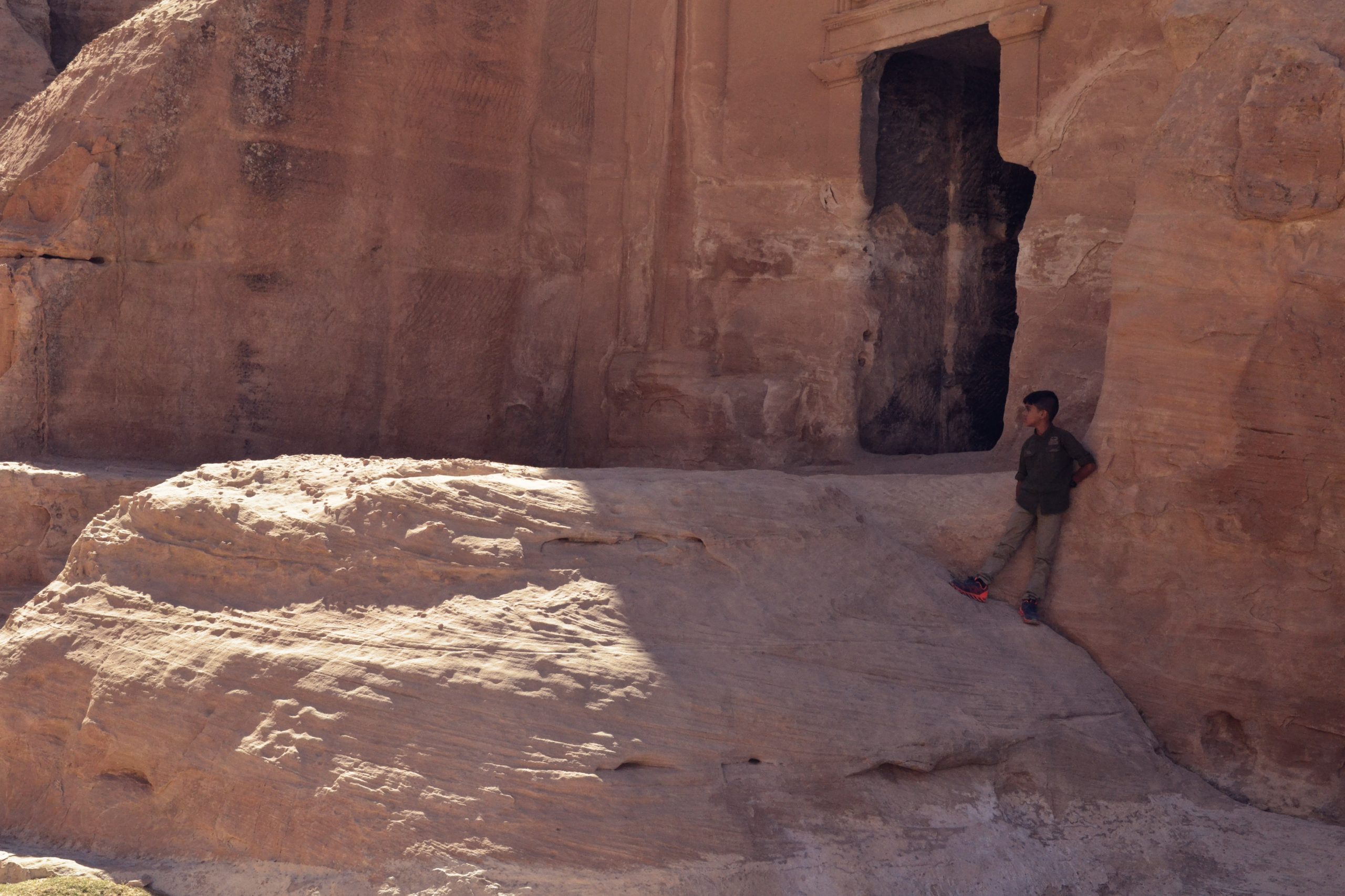
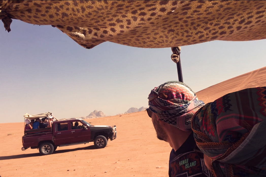
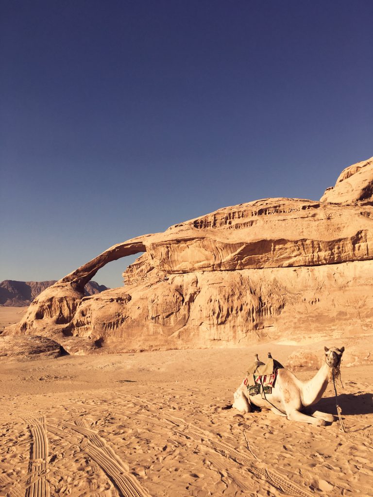
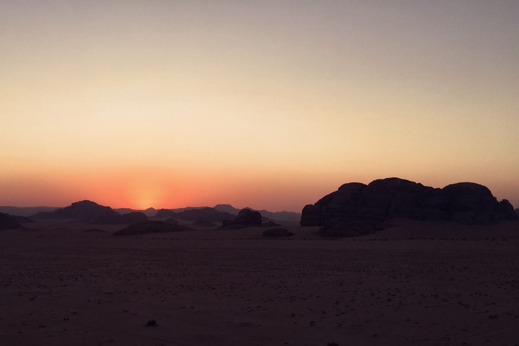
“Ahlan wa Sahlan” are the cozy words that I heard as soon as I stepped on Jordan’s ground. In this welcoming land, rich in wonders, between grains of sand and red rocks you can feel the enchantment and culture of its ancient population.
Learning LogA critical reflection on understanding and creating narrative environments.
In this work, written as part of my MA pathway, there is a critical reflection towards the following aspects of the design practice in the context of narrative environments: collaboration, research, analysis, experimentation and subject knowledge.
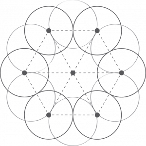
Collaboration is not hierarchical or democratic. It’s a stand-alone system. Everyone contributes to the project giving value to others’ opinion and work. This structure offers the possibility to learn and to progress.
In this work, written as part of my MA pathway, there is a critical reflection towards the following aspects of the design practice in the context of narrative environments: collaboration, research, analysis, experimentation and subject knowledge.
Unique as a SnowflakeChristmas Window Display X TEZENIS
In this live project in collaboration with TEZENIS, realised during the MA Narrative Environments, we have been asked to deliver an innovative design for the windows of the flagship store in Oxford Circus for the Christmas season that communicates the brand’s values, attracts people to enter the shop, is easy to assemble and disassemble and has a low environmental impact.
In response, we have developed the creative proposition “Unique As a Snowflake”: a simulated a winter storm, a whimsical journey of self-discovery in which a variety of beautiful snowflakes highlights the brand’s diverse offering during this cheerful time of the year.
The proposed design is composed of different layers that make it easy to assemble and extremely flexible. The components are four: the printed graphic background, the snowflakes made from a support frame and the undewear to be displayed, the snow and the vinyls to be attached to the glass. Moreover, the support frames are designed to be reused after the window display has been removed, in fact they can be transformed into individual hangers to be used inside the shop.
The concept was developed on the basis of solid research carried out to fully understand TEZENIS’ brand identity. The main objective is to communicate in a joyful and young way the variety of products offered. Typography and copywriting are designed to resonate with the target audience and attract people to step in and rediscover the brand. The visual language is elegant and at the same time trendy and inventive. The colour palette is characterised by the juxtaposition of the muted colours of the drawn elements and the bright colours of TEZENIS underwear. Functionality was an important driver, in fact the design was conceived with space optimization and low cost budget in mind. Moreover, the fact that the main element of the display case can be transformed and reused adds value in terms of sustainability.
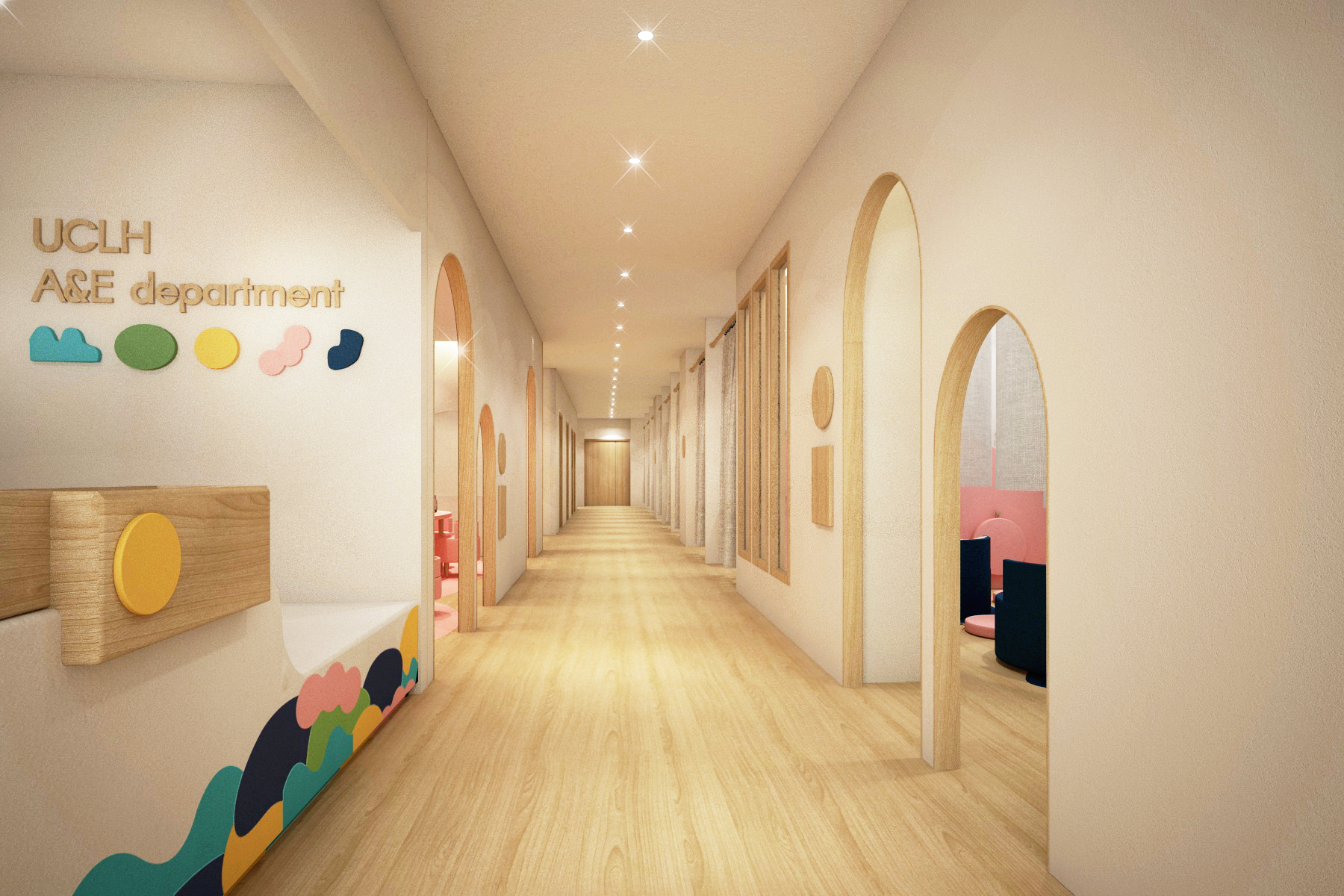
UCLH Children’s A+EInterior Re-Design of the Accident and Emergency Department.
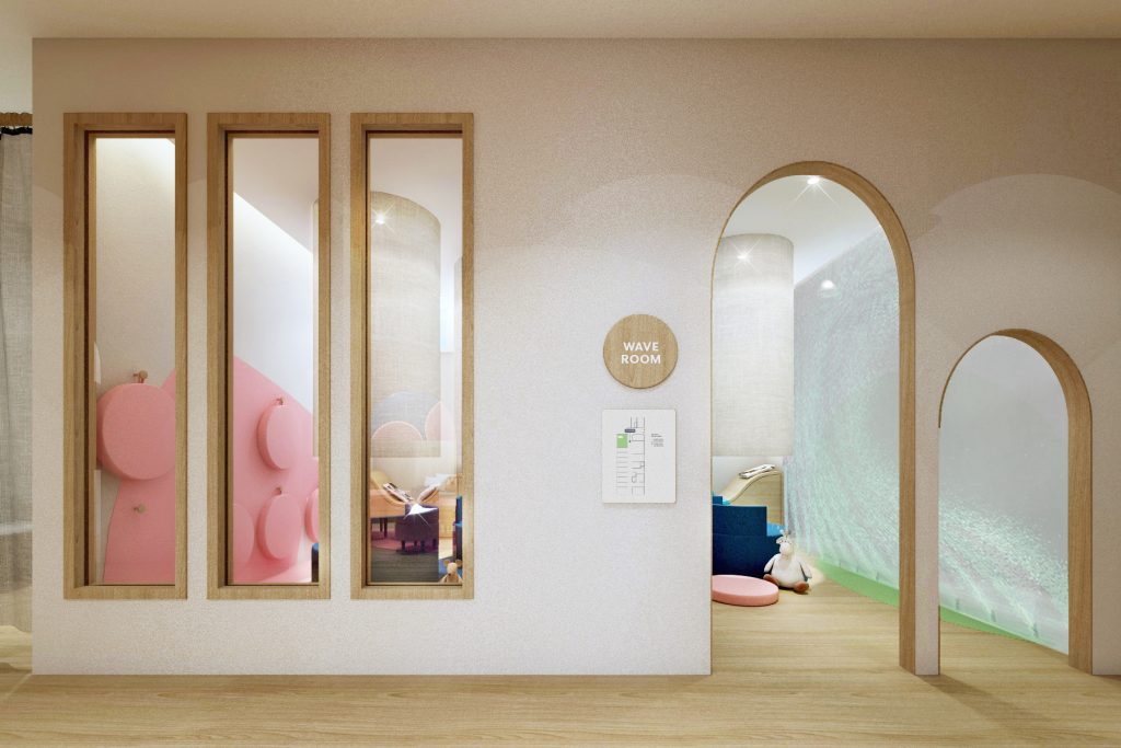
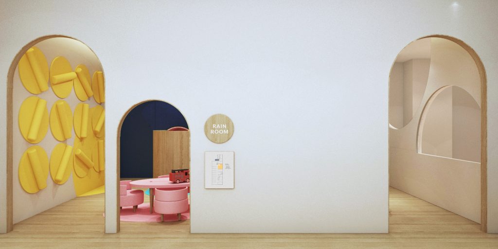
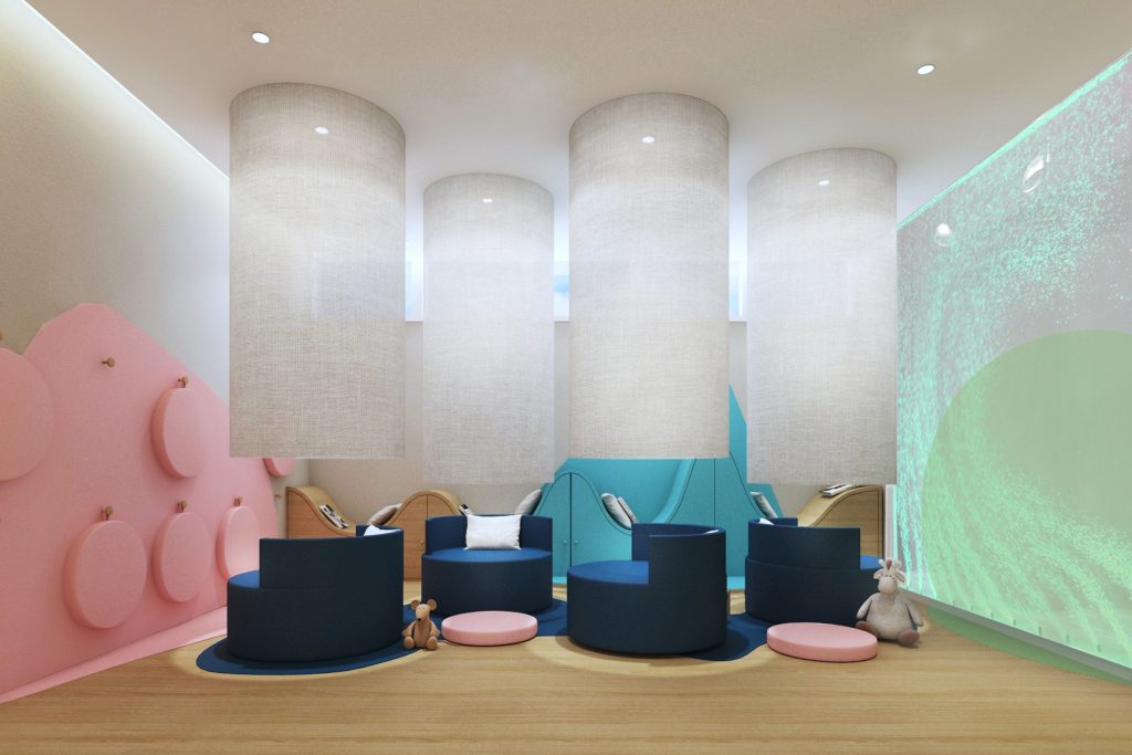
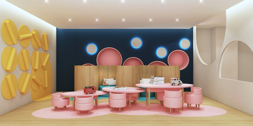
In this live project in collaboration with the University College Hospital London, realised during the MA Narrative Environments, we have been asked to re-design the Childrens and Young Adults A+E department to create a truly patient-focused and age-appropriate environment that provides a welcoming, uplifting atmosphere that alleviates the anxieties of patients and their carers when visiting the A+E.
In response, we have developed a proposal to redesign the children’s A+E into a place of intentional relaxation, to alleviate the anxiety and stress of not only the patients and their parents but also of staff.
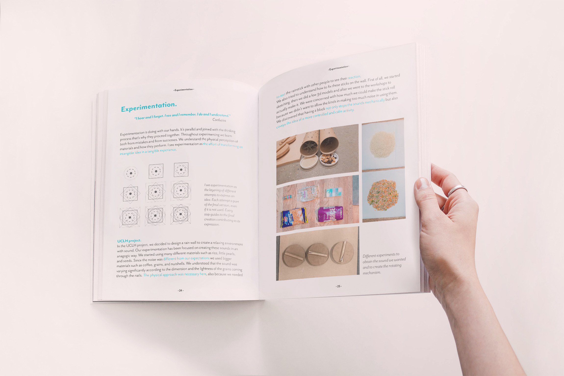
Taking inspiration from one of the most culturally embedded symbols of relaxation – water in all it’s forms, movements and sounds, the design includes a wave room with an air bubble wall, enclosed river seating, a rain room with rain sticks attached to the wall that children can activate, puddle tables and cloud chairs. The colour scheme is muted yet uplifting and relaxing.
Each element has both functional and narrative value. The colours and graphics help to create a visually identifiable environment by helping patients and carers to easily find the area of the hospital to go to and at the same time create an appealing environment for children who feel so protected and welcomed. The furniture offers various relaxation activities inspired by the shapes and sounds of water – there is the possibility to play with the wall elements, draw and even cuddle with their parents in spacious, private seating.
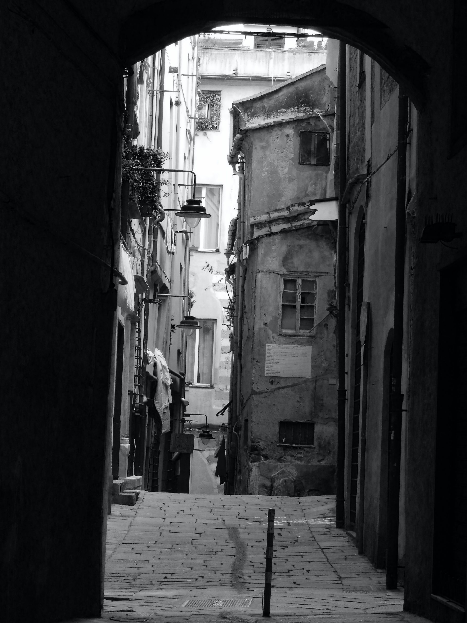
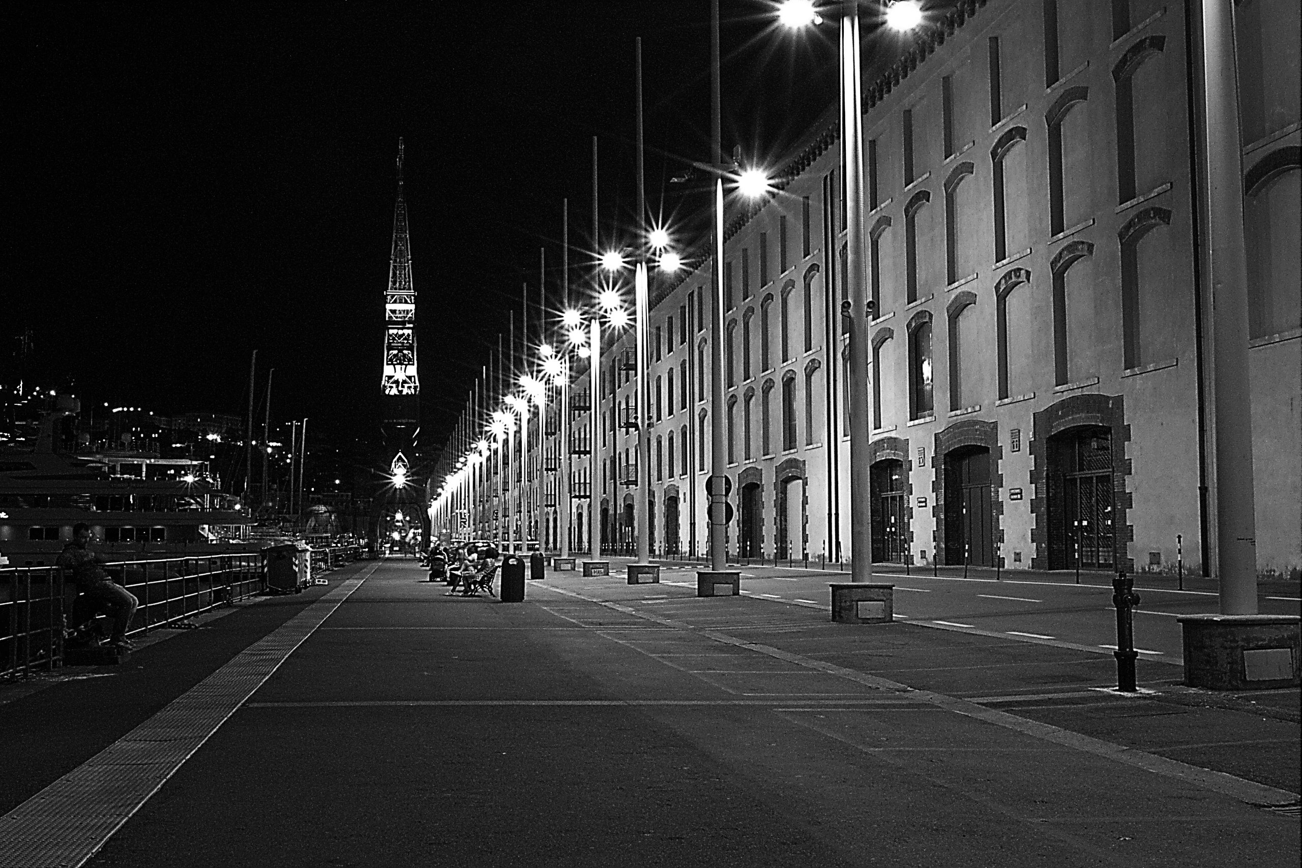
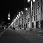
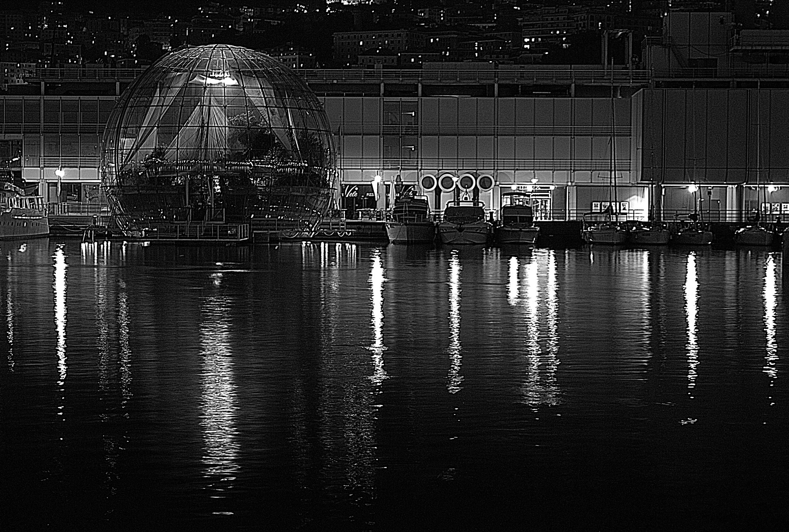
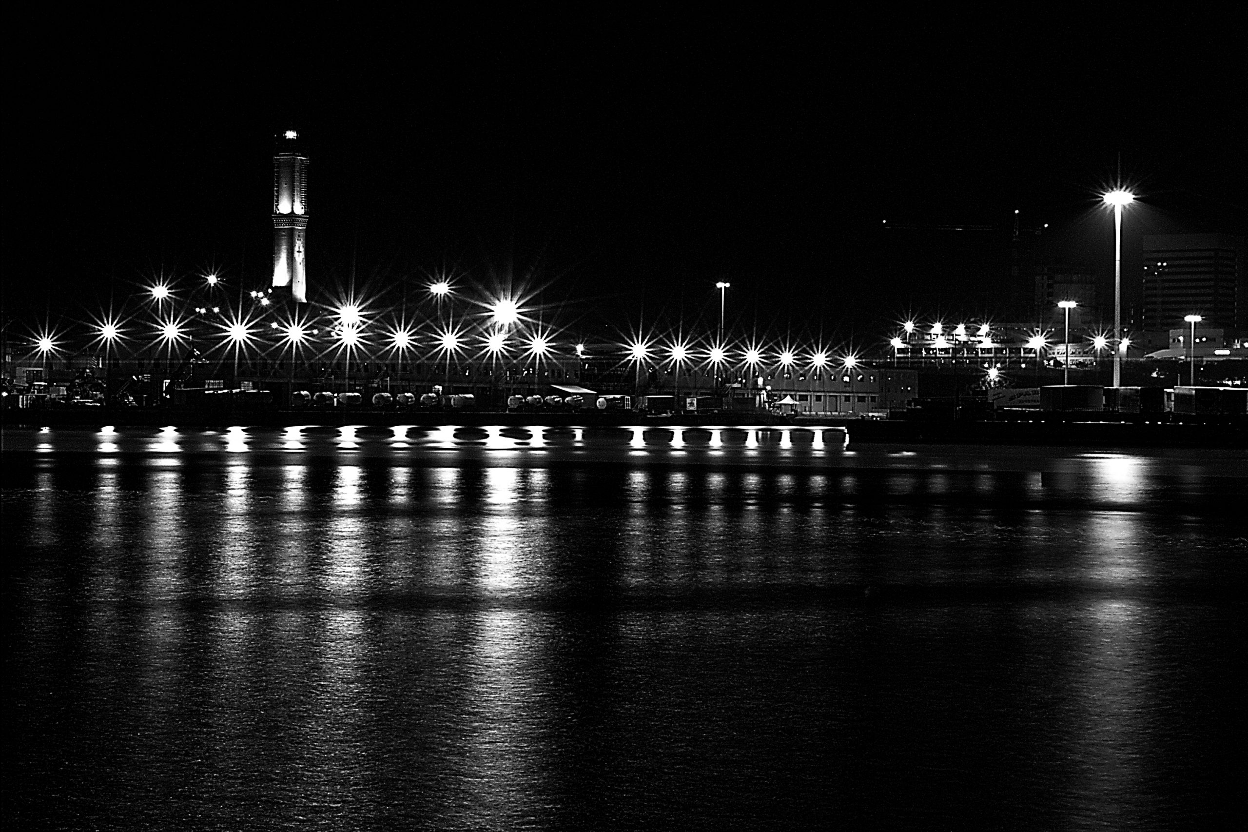
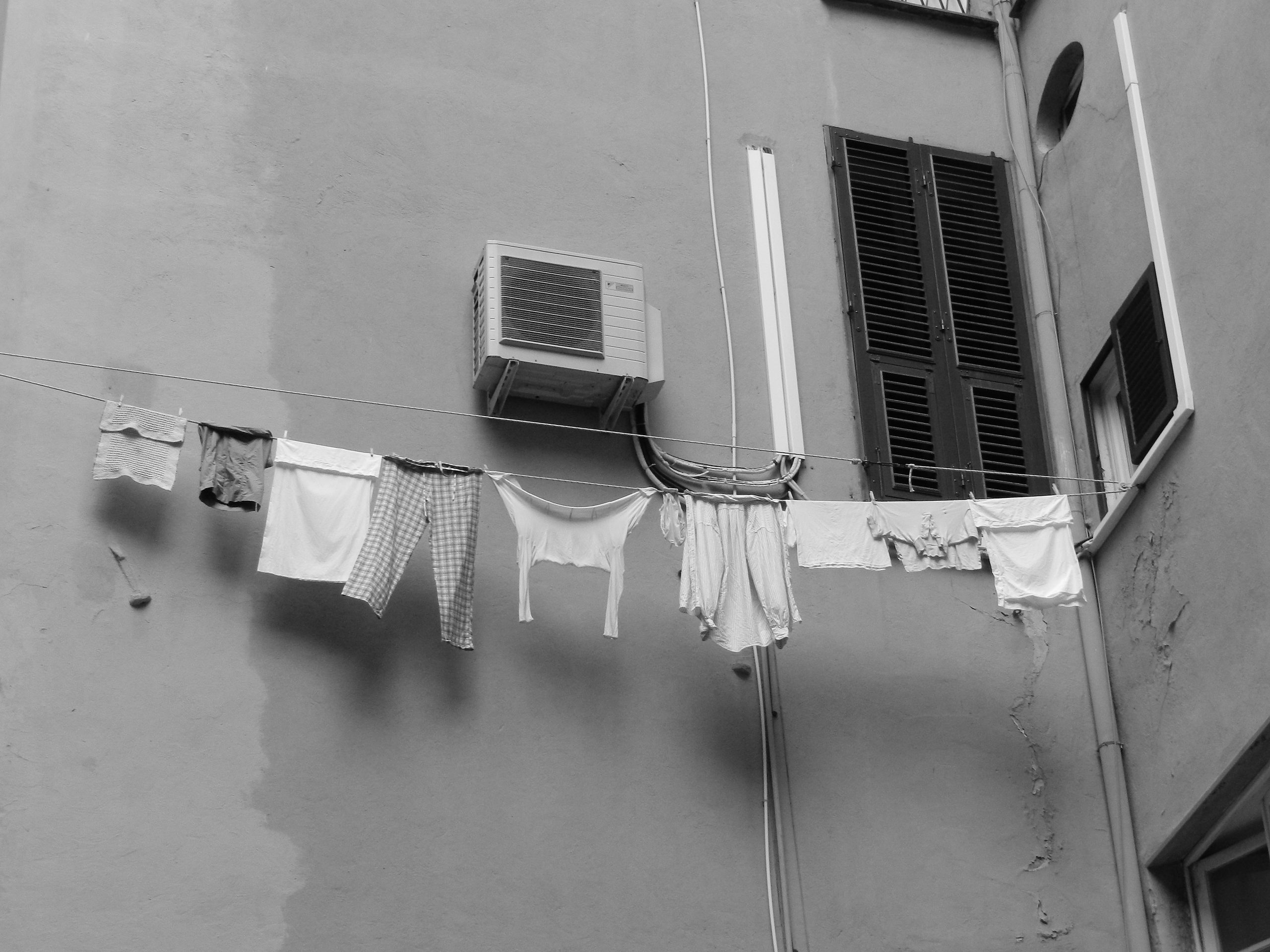
Genoa is a city enclosed between the sea and the mountains.
Here, you breathe the air of tradition and the past while walking in narrow streets, bordered by tall and ancient buildings. Walking in a crêuza you can hardly see the sky, but looking up you can still see women chatting trough their windows while they hang up their laundry. During the day streets are never silent, populated by street performers who sing and play, and from people who have just come down from some cruise ship. But during the night, the silence falls and you will be enchanted by the beauty of the lights reflected in the sea.
Since I was a child photography has always been my passion, I used to take pictures with the 3mpx camera of my first phone or with my mother’s old analogue, just following my instinct.
I approached this discipline in a significant way during my high school years, when I decided to attend a digital photography course, with a woman photographer full of energy and love for her practice. I remember I was happy every Tuesday night when I was going to classes, with a notebook and a pencil, willing to learn everything without missing a word.
Day by day I realized how exciting it was for me to be able to convey objects, places and people’s emotions in a shot.
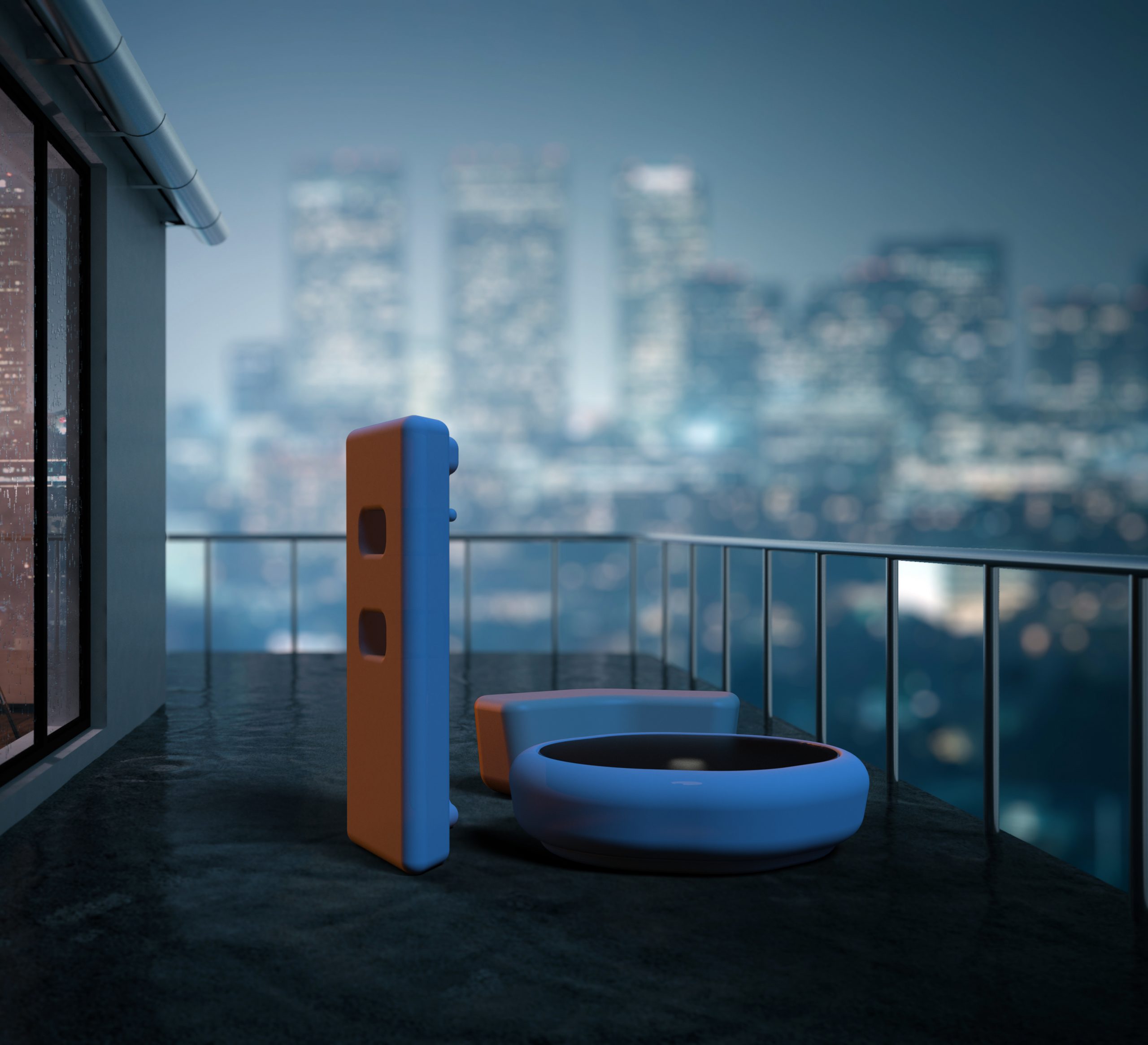
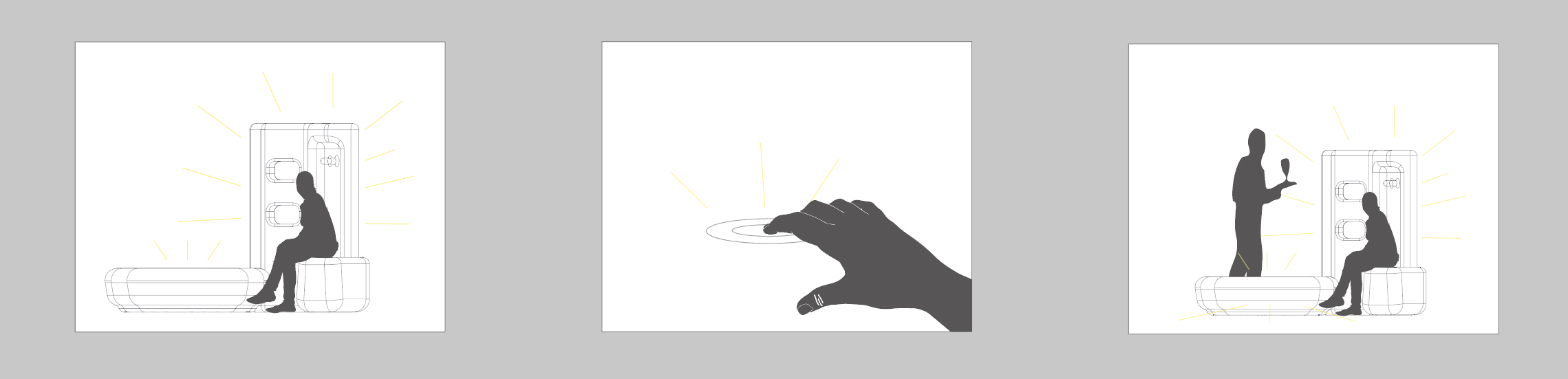
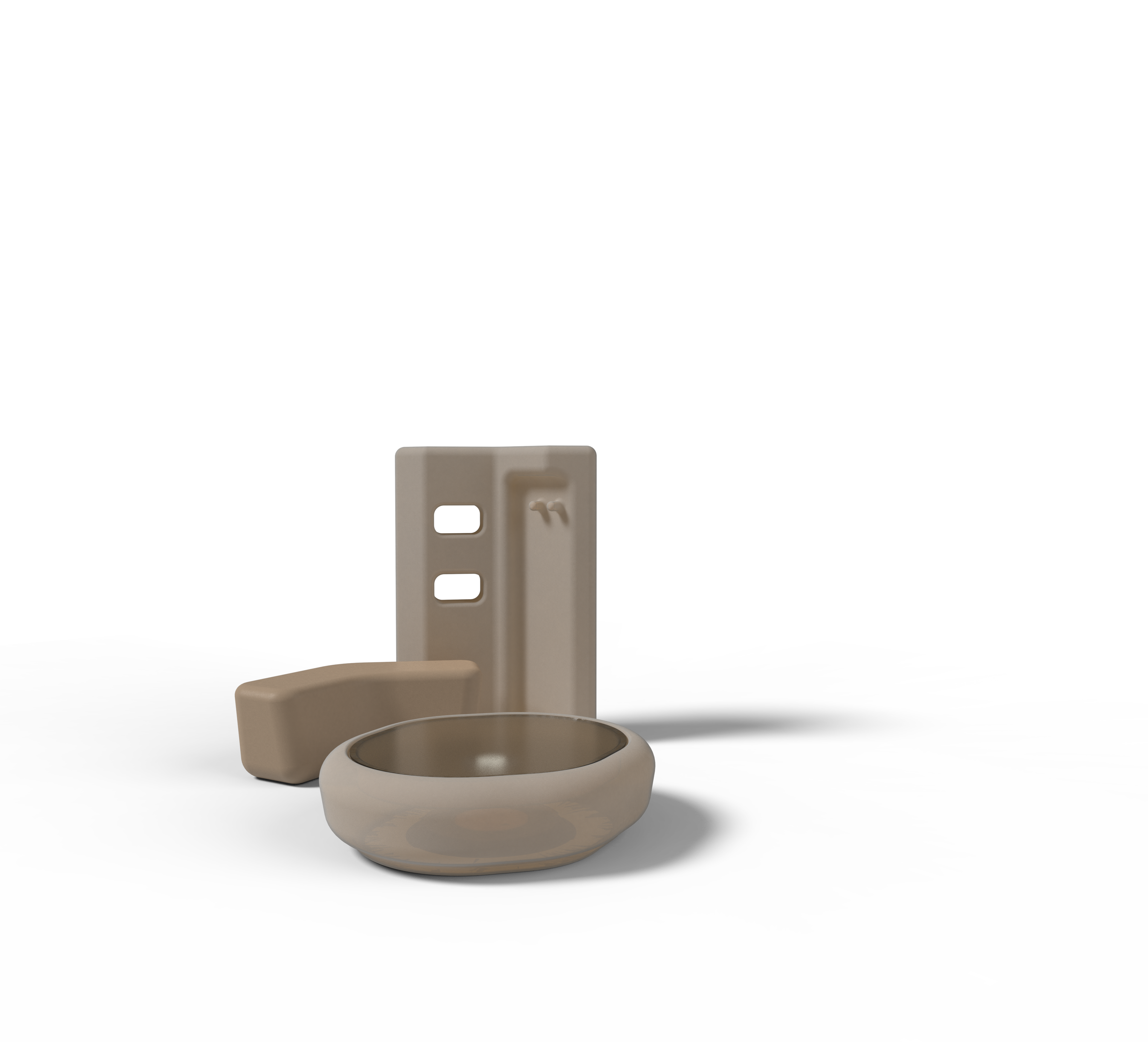
In this live project, realised during the BSc in Industrial Design, in collaboration with Slide Design, specialized in plastic furniture complements, I have been asked to work with rotomoulded polyethylene and moulded polyurethane to design a collection of furniture in line with the company’s language.
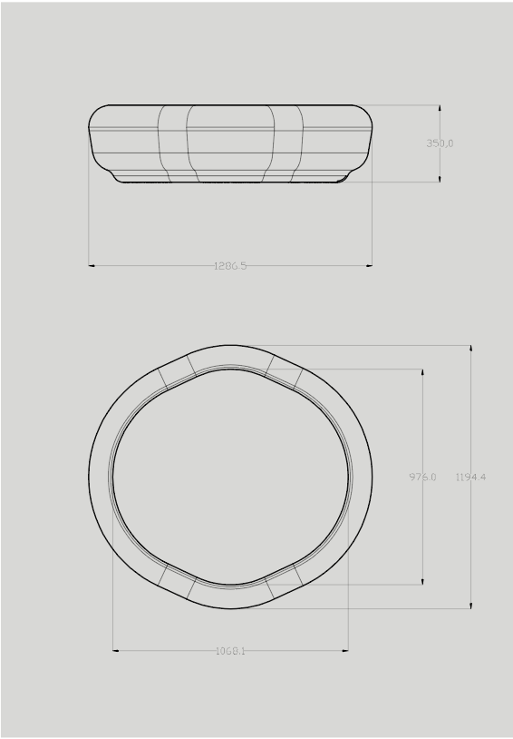
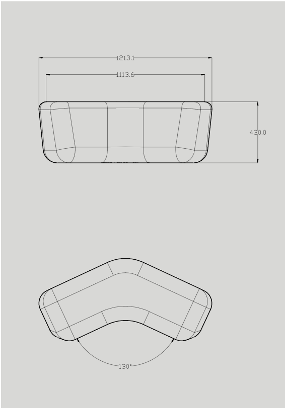
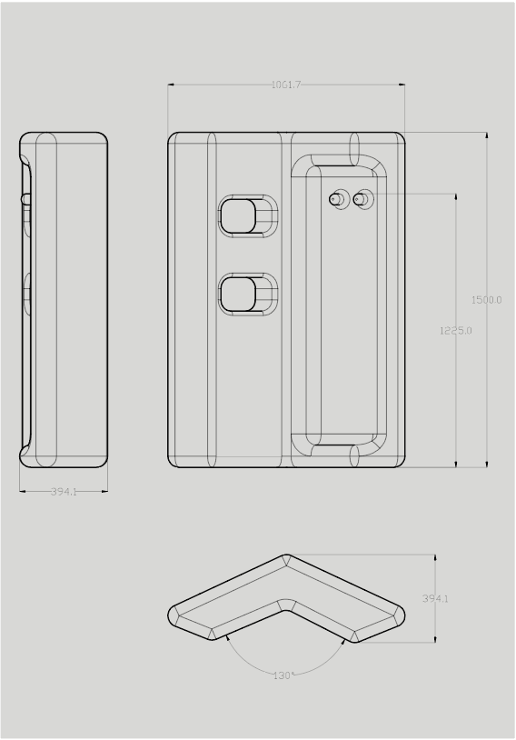
The answer to their brief resulted in HexLine: a furniture collection designed for a Lounge Restaurant and Bar, aimed at optimizing spaces, managing and improving the experience offered. The collection consists of a lit low table, a soft seat and a lit partition.
The table was conceived from the intuition of being able to capture the waiter’s attention through the use of light, this product was developed to integrate technological components inside it through a simple and essential aesthetics. The central part of the supporting surface is sensorized and easily identifiable by a concentric light. Through the touch of this area, the rotomoulded surface lights up to attract the waiter’s attention, thus using a new way of communication.
The seat is made of soft polyurethane and welcomes the person who sits on it, pandering to the weight of their body.
The partition is made of rotomoulded polyethylene. Its shape follows the seats and thanks to its asymmetry creates an architecture inside the lounge bar. The product can be lit from the inside and has a sensor of ambient light that gives the possibility, if placed outside, the automated ignition when the evening falls. The product is perceived in different ways depending on the point of view from which it is observed, on the one hand has some hangs for clothes while the other has some openings that in addition to visually lighten the structure can be used as objects holders.
In this project there is the integration of a simple technology to improve the restaurant and bar lounge experience, giving value to the human figure.
The intent is to create an environment in which people can interact with the furniture itself.
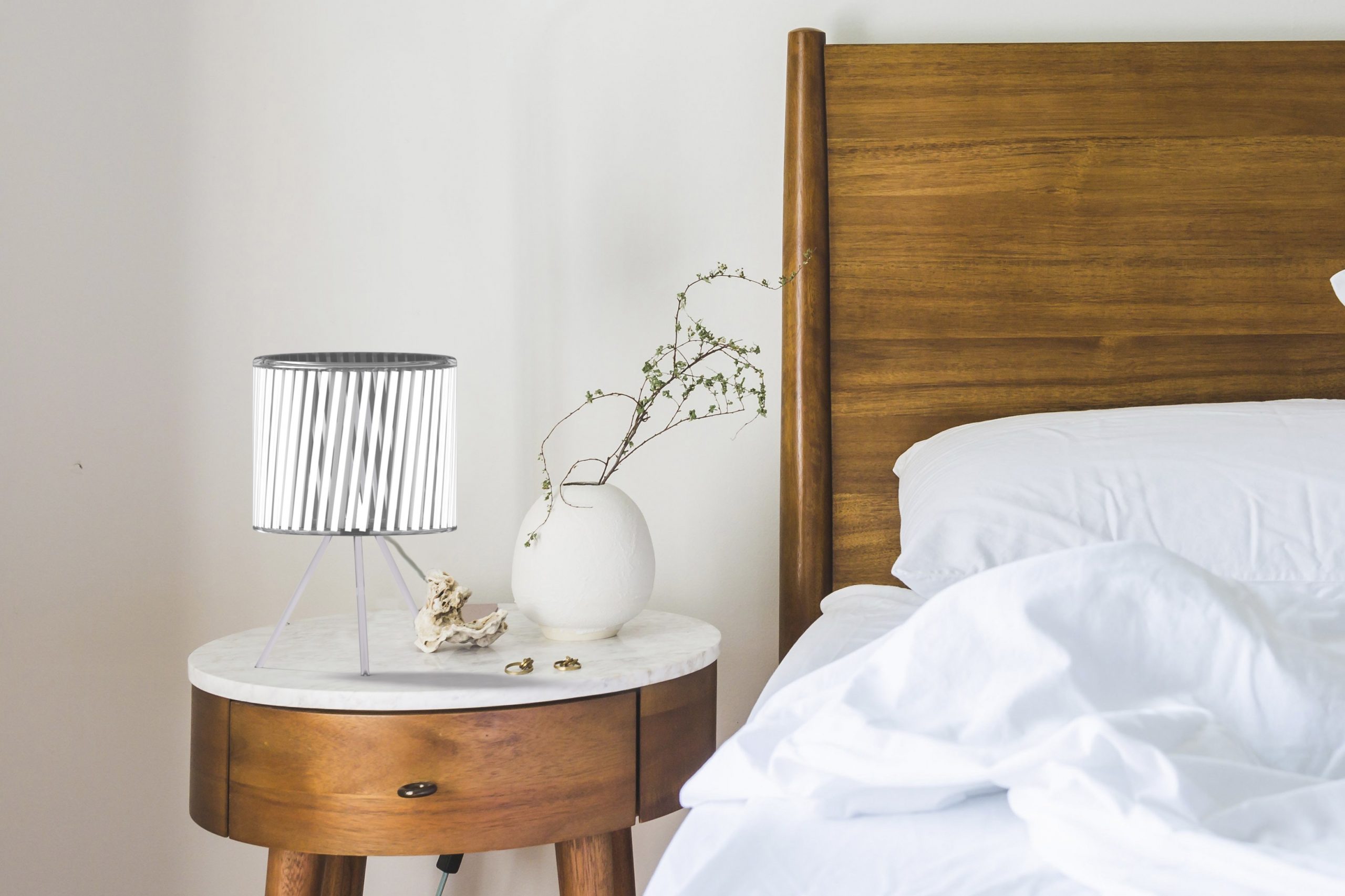
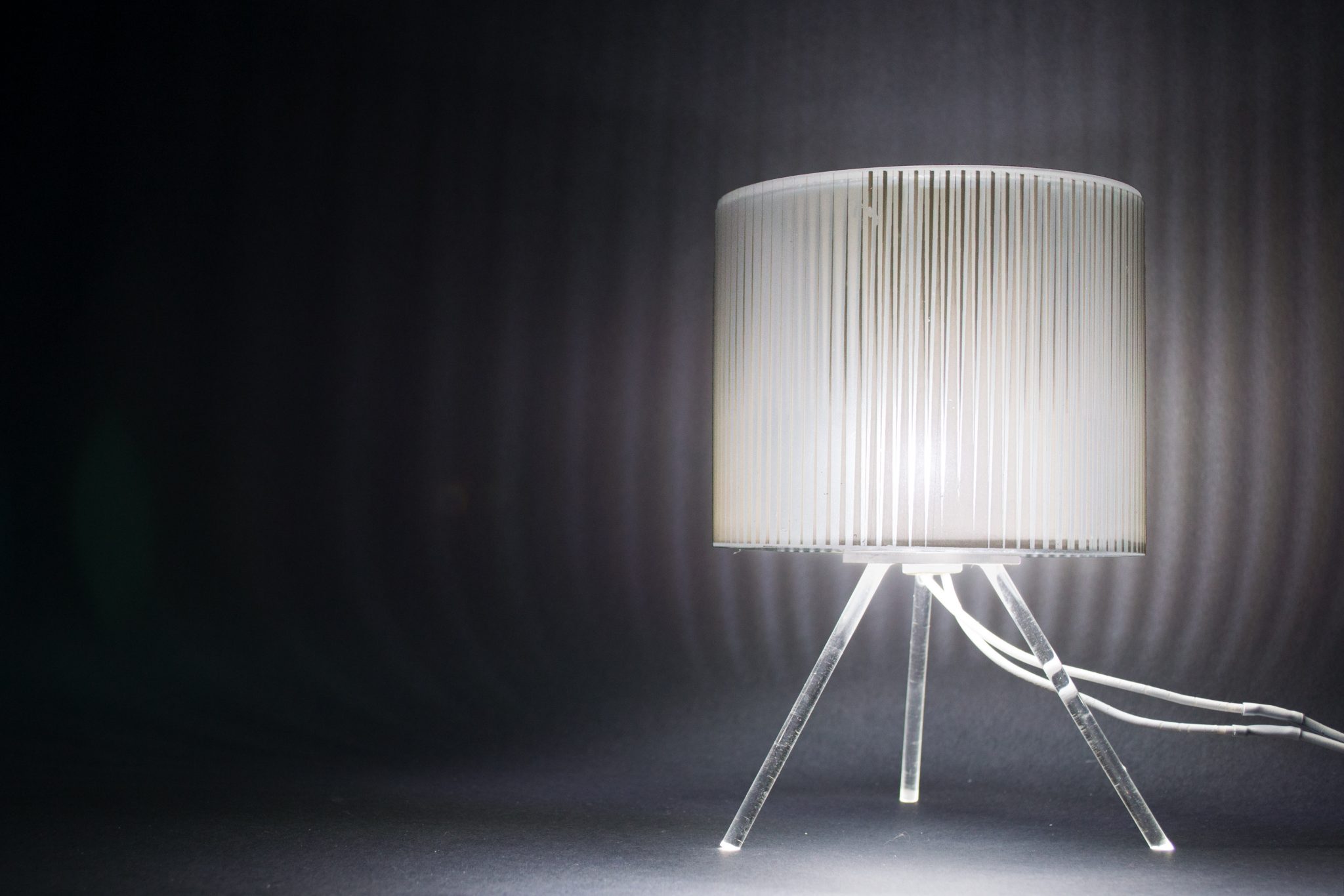
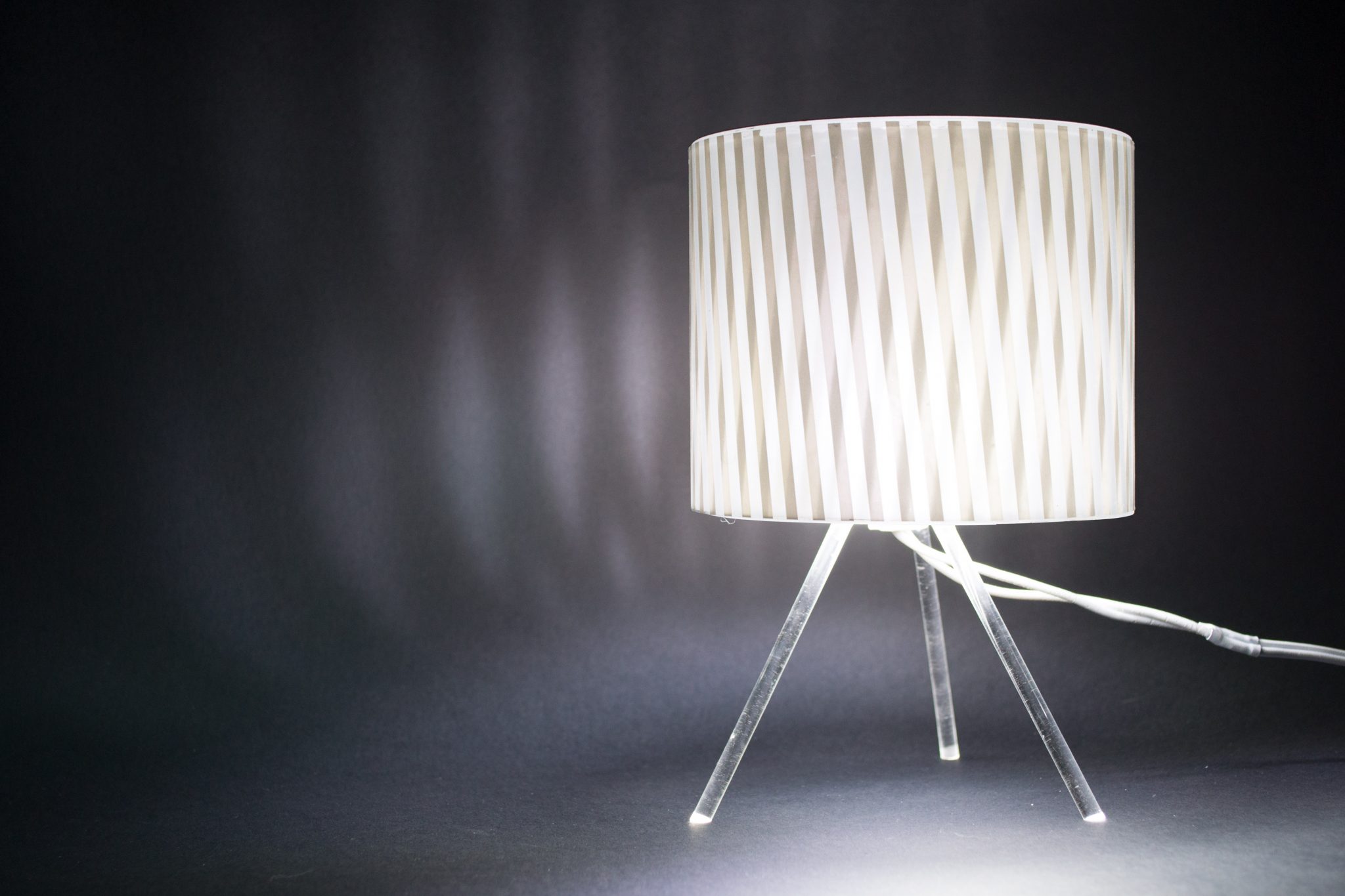
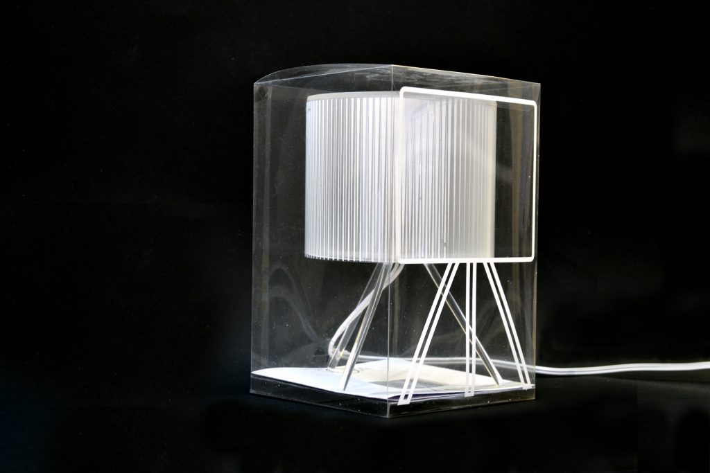
Moira was born from the idea of designing a lamp shaped by light.
Made entirely of plexiglass, it is supported by three legs, and the lampshade, which can be rotated to modify the luminous effect, is decorated with different geometric patterns, so as to create a play of a thousand reflections on the surrounding surfaces.
Thanks to its essential shape it can be proposed on a small living room table, as atmospheric light on a bedside table in a bedroom or, again, as a sculpture-object.
The light effect studied and recreated consists of a combination of light and shadow.
Its definition in three key words, rhythm, repetition and overlap, guided the design process.
To emphasize the light effect, it was chosen to make the product almost invisible, which is why transparent PMMA proved to be the most suitable material to recreate a simple and light shape.
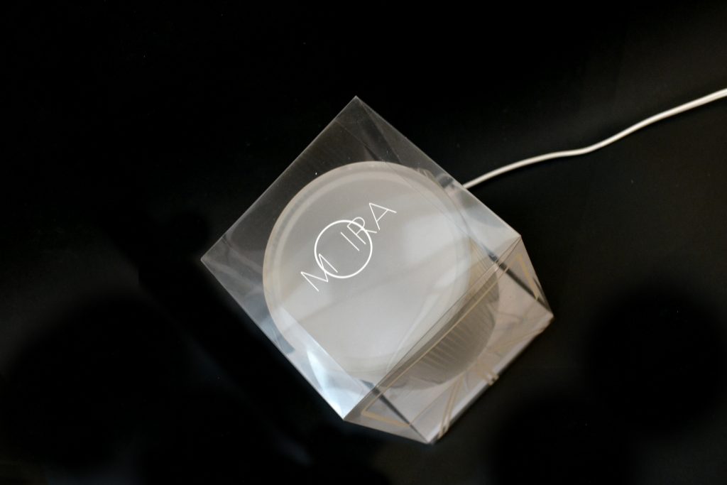
The name of the product is inspired by the idea of the moiré motif and the logo was designed with the morphology of the lamp in mind to highlight the circularity of the lampshade in Moira’s “o”.
The packaging has been studied and designed to recall the aesthetics of the lamp, both in transparency and lightness. Made of transparent PVC, it protects the lamp without covering it and emphasizes it through the outline printed on its front surface.
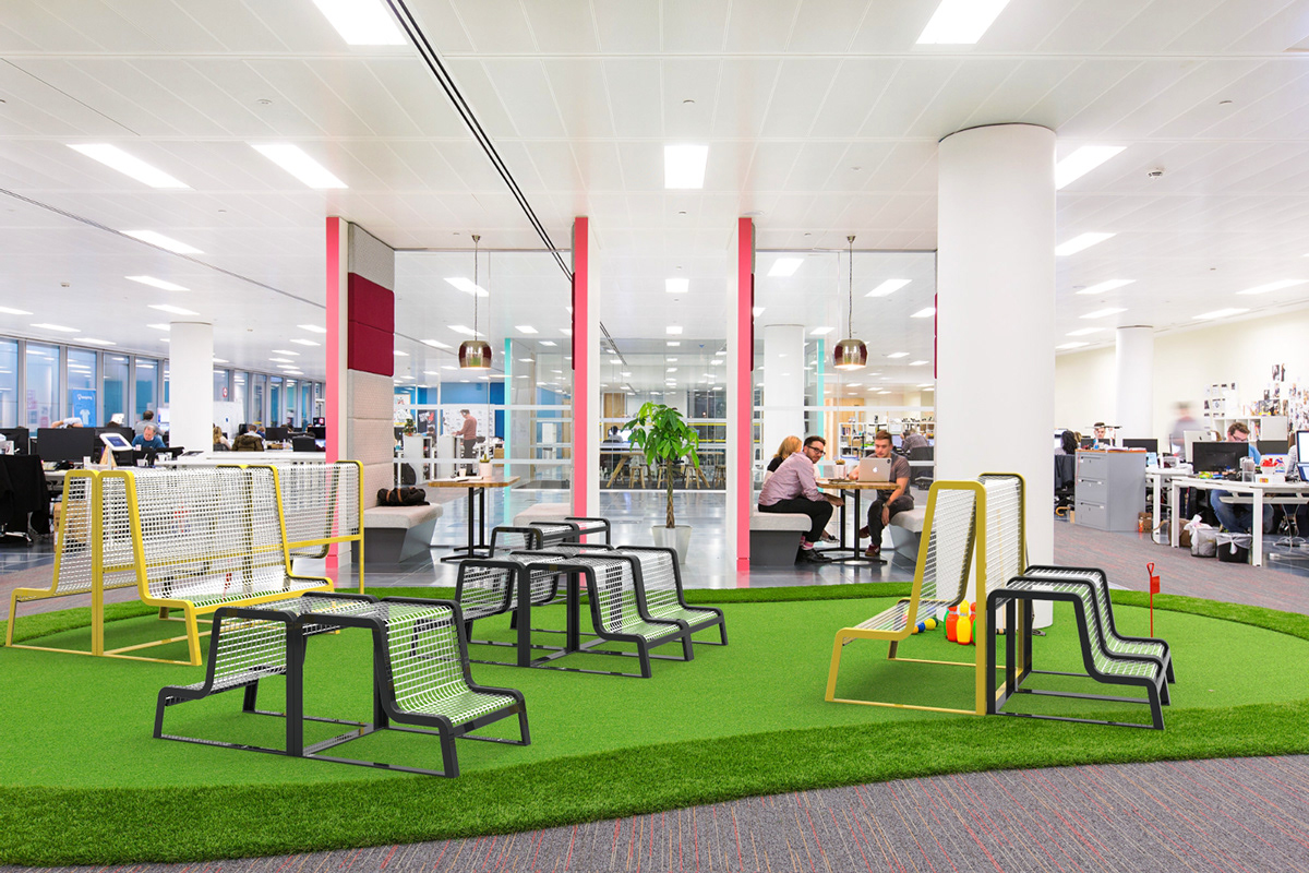
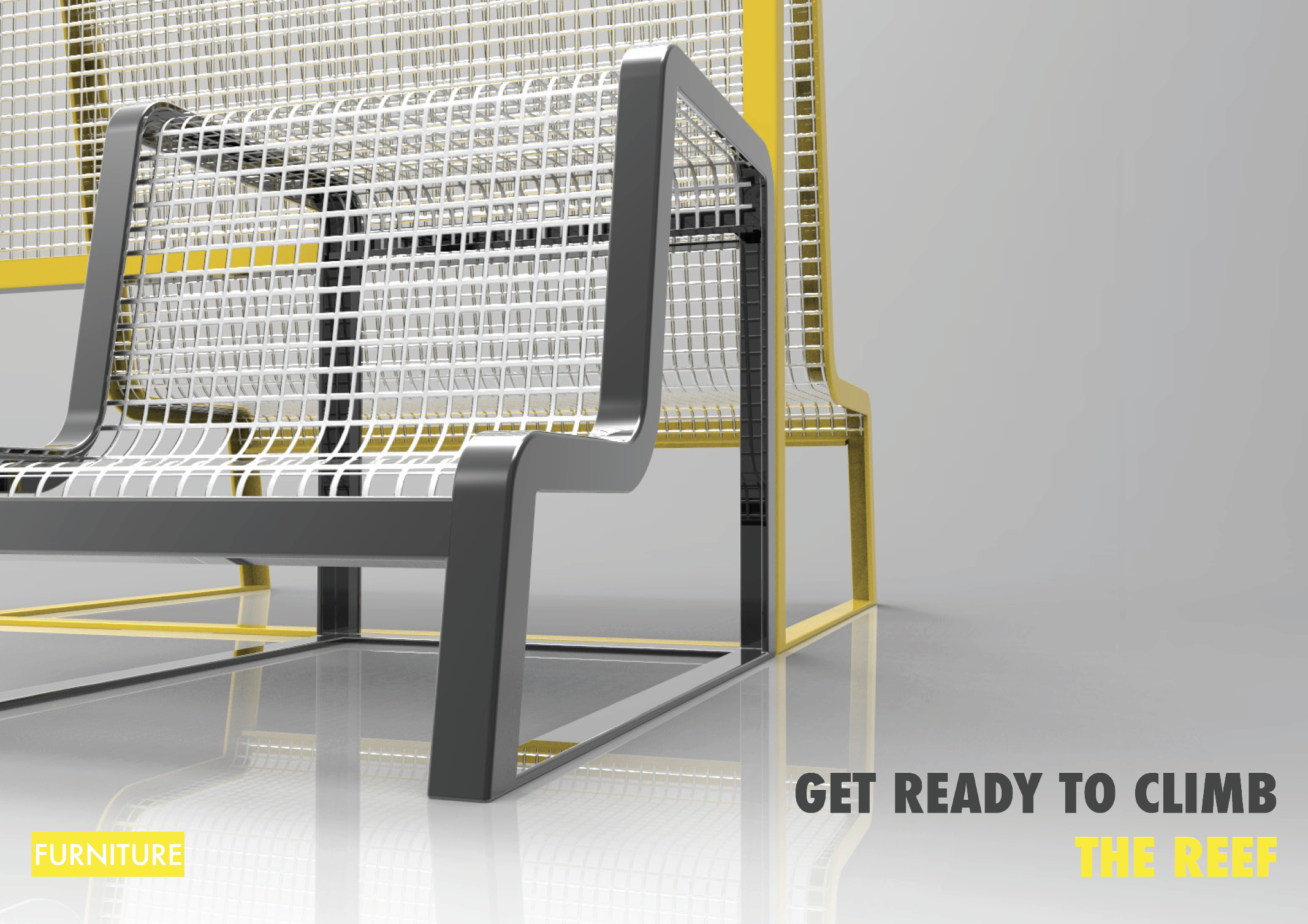
BuzziReefModular seats for an ever changing space.
BuzziReef is designed to be included in the collection of the Belgian company BuzziSpace and responds to the material, chromatic and philosophy choices that the company implements.
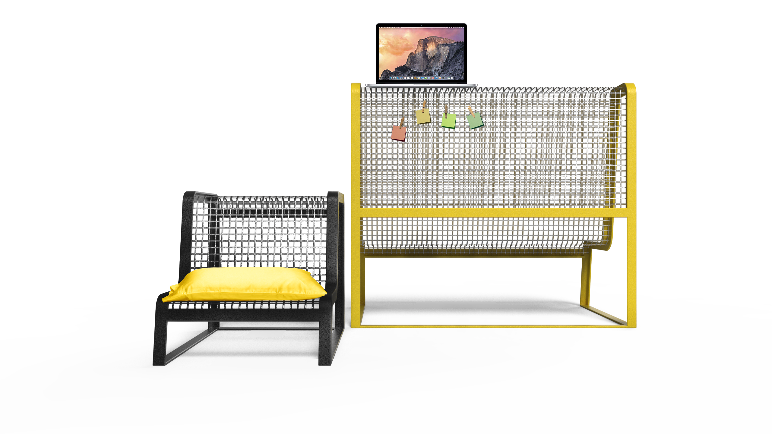
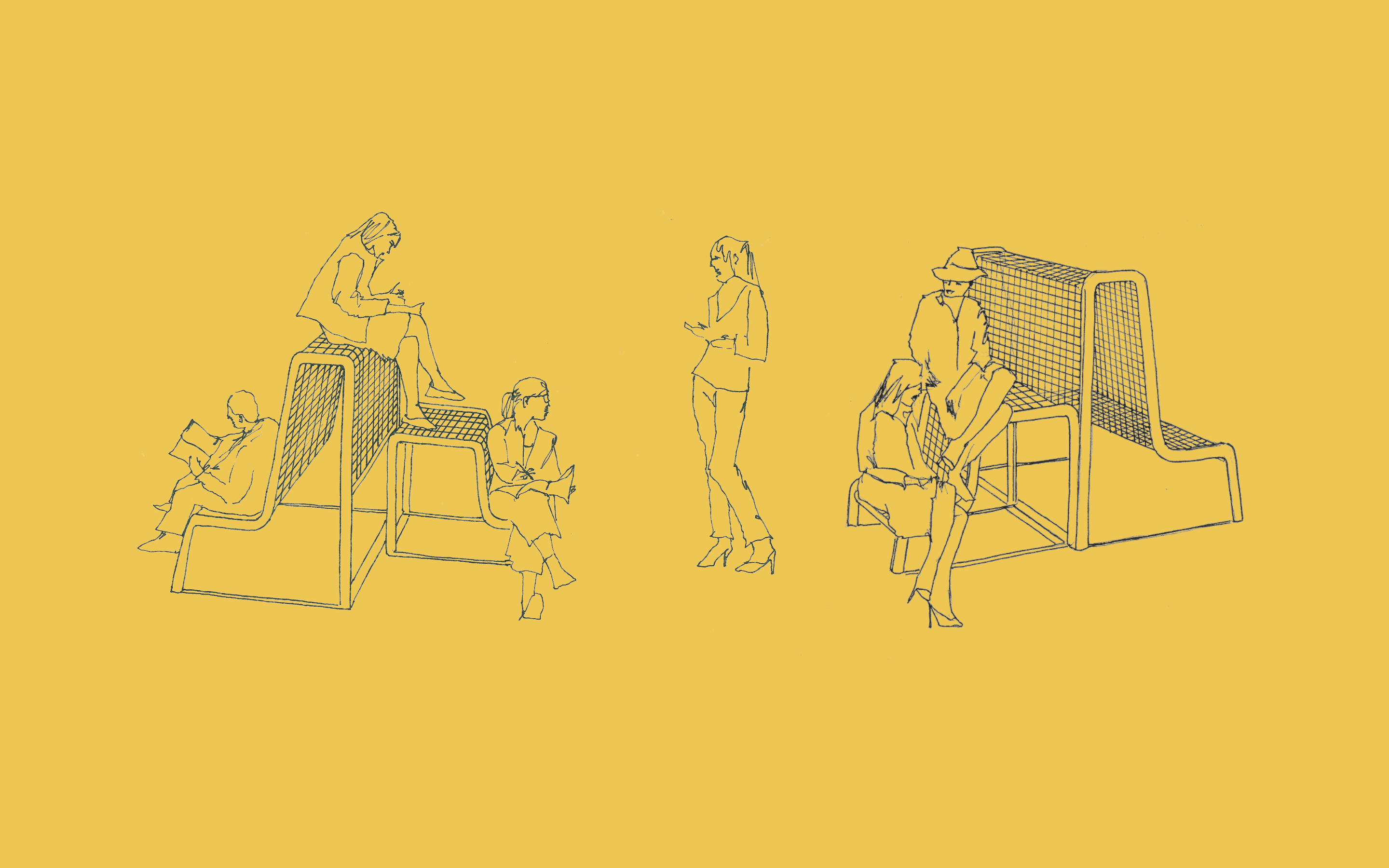
BuzziReef was conceived as a product designed for the leisure areas of coworking spaces. It is composed of two modular seats that, combined in different ways, generate a space that is always different, adapting to wider or smaller environments. Both products have a supporting structure in painted aluminium and a seat characterised by a metal mesh.
Starting from the analysis of existing coworking spaces, I first focused on the analysis of shared work spaces and then on leisure and break areas in detail. These two areas, often communicating within an open space, respond in their configuration to current trends in the world of work, i.e. the flexibility and dynamism of the place itself. The most important need of the relax area was to be flexible and adaptable to different events and to accommodate different flows of people.
The aim of the project is to make this zone easily identifiable and different from the work zone, to enhance the quality of of work breaks, a necessary moment for a productive day, to stimulate the interaction between people and to encourage dialogue.
The seats have been designed with attention to the human figure, with the help of various study models and Le Corbusier’s Modul’or.
The bench seat is 43cm and the shelf is 130cm from the floor, thus respecting the proportions of the human body. The stool, on the other hand, has a seat at 27cm from the ground, which is perceived as a high step which to sit on; there is also a top 70cm from the ground, which can be used as a seat, as an armrest or auxiliary table to support the bench.