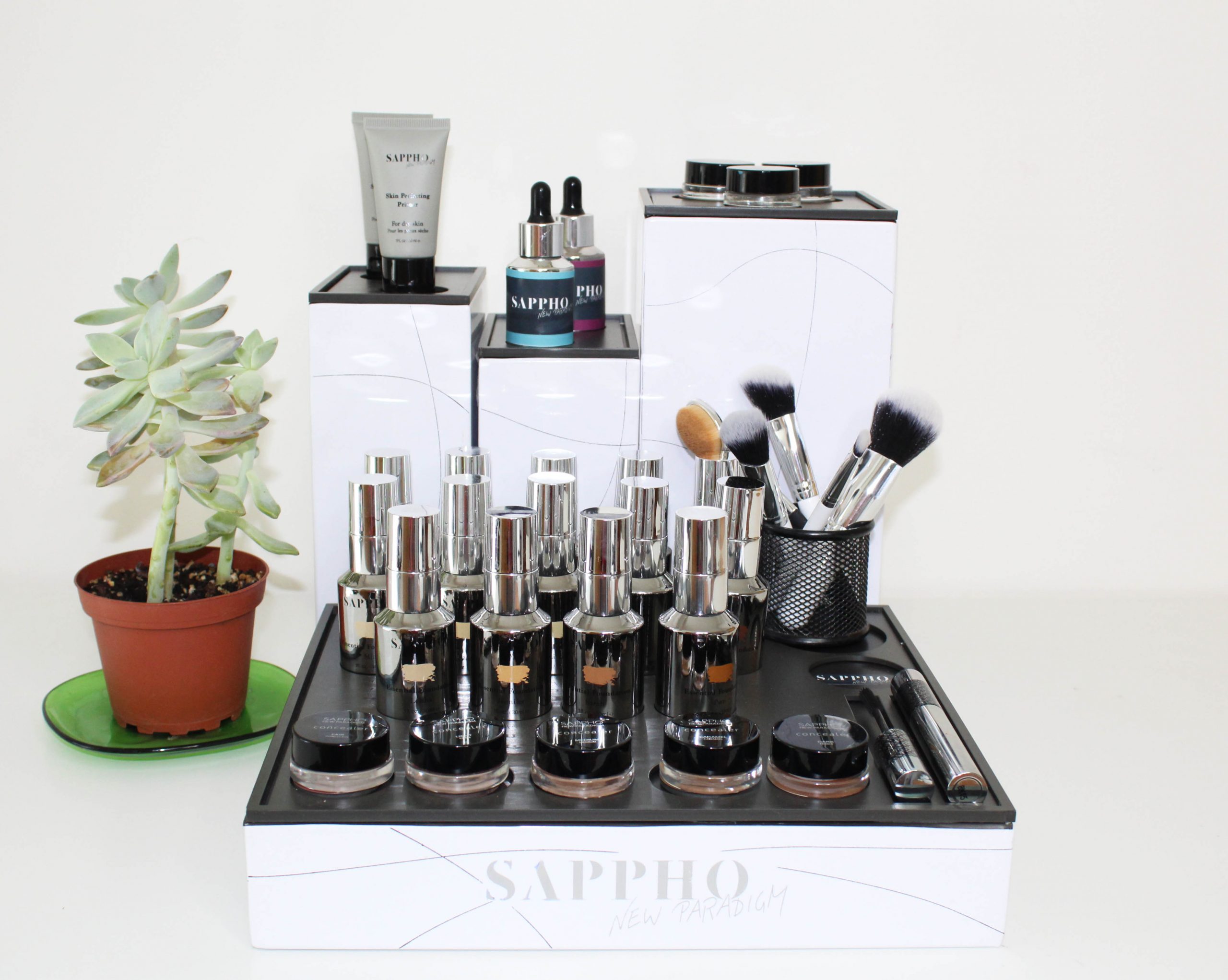
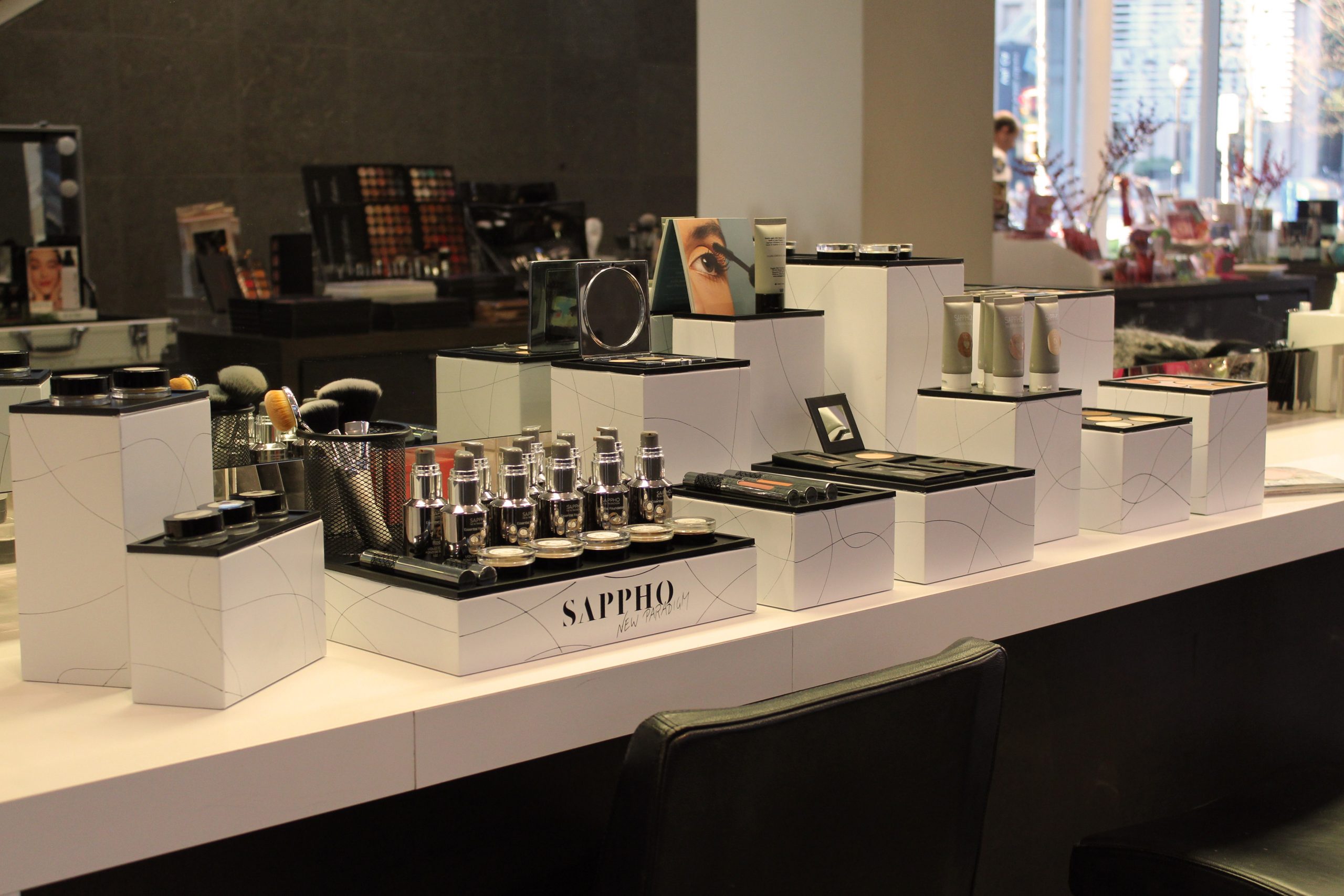
Origins Creatives

Origins CreativesUAL Awarding Body graduate showcase.

Origins Creatives 2023

Origins Creatives 2022

Picture of a group of people looking 2d graphic artworks on a table

Origins Creatives 2021

Damien Hirst : End of a Century

Walking among butterflies trapped in acrylic paint, a cow’s head consumed by flies and sharks crystallized in formaldehyde can but enhance the most adequate reflection now that the disease surrounds us.

Damien Hirst : End of a Century is at Newport Street Gallery 7/10/20 – 7/3/21

Rooting Failure for Bloomsbury Festival

Rooting Failure, the final project I realised in collaboration with Paolo Di Gennaro at MA Narrative Environments, has been featured at the Bloomsbury Festival 2020.
 
It was exciting to see it come to life and see how it merged with the Crypt Gallery environment to tell a new narrative. The most rewarding aspect of this experience was seeing the interest and involvement of people who shared their struggles and thoughts with us. 
I am the most grateful for this possibility and I would thus like to thank the Bloomsbury Festival Team and all of our collaborators and supporters who have made this possible.

Rooting Failure is a site-specific, critic, interactive installation challenging common understandings of failure. By taking a self-exploratory walk through the subterranean spaces of The Crypt Gallery, participants undergo a journey of recollection, discovery and revelation that examines the human tendency to hide disappointments, in the process demonstrating how sharing vulnerability fosters social empathy.

The burden of being continually successful confronts our ordinary life facing expectations to comply with the contemporary ruling market-led demand for perfection.

The aim is to open up a conversation about failure in a time in which it is either unspeakable or subjected to the capitalistic imperative to dress the outcomes of all actions in the garb of success. In this way, failure, as an essential component of character development, may be de-stigmatised in a results-driven, fear-stricken society.

Five Minutes with Monet

Today I had the opportunity to visit an unusual exhibition, composed of a single painting. 

Here face to face with Monet’s “Water Lilies” you can experience five minutes alone with the artwork. This innovative idea proposed by Palazzo Ducale in Genoa takes advantage of social distancing to transform it into a unique opportunity to immerse oneself totally in art. 

This experience has been for me a starting point to reflect on how design and art can exploit the concept of social distancing for reframing it as an immersive and emotional aesthetic experience.


Rooting Failure

Rooting FailureA participatory installation challenging the notion of failure.

Awarded with SPATIAL PRACTICES PRIZE 2020

UAL : Central Saint Martins

Featured at BLOOMSBURY FESTIVAL 2020: VISION

The Crypt Gallery, Bloomsbury, London

21-25 October 2020

Featured on ARTS THREAD

Featured on CSM STORIES


Inspired by Jules Verne’s Journey to the Centre of the Earth, Rooting Failure is an interactive installation challenging common understandings of failure. By taking a self-exploratory walk through the subterranean spaces of The Crypt Gallery in Bloomsbury, London, participants undergo a journey of recollection, discovery and revelation that examines the human tendency to hide disappointments, in the process demonstrating how sharing vulnerability fosters social empathy.

The burden of being continually successful especially confronts students and young workers aged under 30 years, who face expectations to comply with the ruling market-led demand for perfection.

The aim is to open up a conversation about failure in a time in which it is either unspeakable or subjected to the capitalistic imperative to dress the outcomes of all actions in the garb of success. In this way, failure, as an essential component of character development, may be de-stigmatised in a results-driven, fear-stricken society.

The project started as a critical reflection about how we represent ourselves in the digital and physical contemporary society aiming at always appearing successful and flawless. This has led to extensive research on sociological and psychological studies on the concept of failure and self-representation and social research on the perception of failure among people. Along the process I was driven by the goal of creating a design piece encouraging reflection that would unfold through a bodily experience that had a materiality in space.

Rooting Failure aims at combining intellectual reasoning with spatial interaction by creating an environment of acceptance of failure throughout a physical and emotional journey.

Rooting Failure is original in the blending of its fundamental traits, it deals with an intangible subject in a tangible experience where people are the protagonists interacting and modifying the space with their presence and connecting emotionally with it and the topic. The environment talks with a solemn tone of voice. It refuses the ironic take used by a large part of the analysed case studies and it tells a story of accepting failure, without focusing on what has to occur after it. 

The concept development and its unfolding onto the space are based on different spatial and narrative theories.

The analysis of Freytag’s Pyramid allowed me to define the dramatic arc I wanted to achieve through narration. The identification of the five phases plus the inciting incident of the pyramid helped me to define the six stages of the experience and the relative intensity of emotions that I wanted to convey to those who experience it. Starting with the sequence of the moments, the desired emotions and their positioning in space was fundamental to define the details of each part in a consistent way. In the experience, the involvement of people grows in the central part of the crypt, with the threads’ interaction and the immersion in the three rooms symbolizing the feelings of failure, and reaches the maximum intensity in the Raft Room through the discovery of a new environment that promotes the acceptance of oneself and others. 


The study of the structure of Le Corbusier’s Architectural Promenade was fundamental in defining the narrative function of the crypt’s subspaces, making the path coherent in its development. People cross a threshold both narrative and physical, encountering the poster which initiates the narrative universe of Rooting Failure and crossing the door of the crypt to bodily immerse themselves in the phases of the experience. The elements in the entrance, which has the function of the vestibule, work as an introduction to space. The central action takes place in the corridors and chambers that have the function of the questioning, requiring people to make a physical and mental effort to cross them. In the Raft Room, reorientation takes place as physically turning around the poem written on the sail and discovering its double meaning creates a moment of reflection and openness to new visions. The culmination of the experience takes place in the Hallway through the written exchange of personal stories and opinions.

Architectural Promenade

In the following videos you can see the user journey and the environments visualizations. 

The following booklet contains an extensive analysis and explanation of the whole project:

MANE Work in Progress Show 2020

MANE Work In Progress Show 2020Narrative meets Exhibition Design

Projects are laid over a unique angular yet soft landscape, inspired by natural geometric forms. The environment, modular and tessellating, can be adapted to form itself around objects.

The exhibition is organised in three realms – Transformation, Connection and Reflection – and it takes the visitor on a reflective journey through the discovery of each graduate project. Plinths and elements are placed inside a colored grid that from the wall to the ground defines the exhibition landscape and identifies the realm explored by each project.


Make Up Display for SAPPHO

Make Up Display X SAPPHOA display inspired by the lines of British Columbia.

This display has been designed for the Canadian, organic and vegan, beauty brand SAPPHO NEW PARADIGM founded by make up artist JoAnn Fowler. 

The choice of materials, shapes, colors and graphics come from a careful study of the brand, starting from its vision and values to its origins and its close ties with the Canadian land of British Columbia. The display is composed of a total of twelve towers that showcase the entire collection. Each of them is made with a painted, printed and bent metal sheet. The top consists of a perforated sheet that allowas to position the different products. It is removable and can be updated as the collection expands. The different towers, that together with their different heights shape the display, are inspired in particular by the Vancouver high-rise skyline and recall in the graphics the varied landscape of their land of origin, that extends from the sea to the mountains.

sustainable

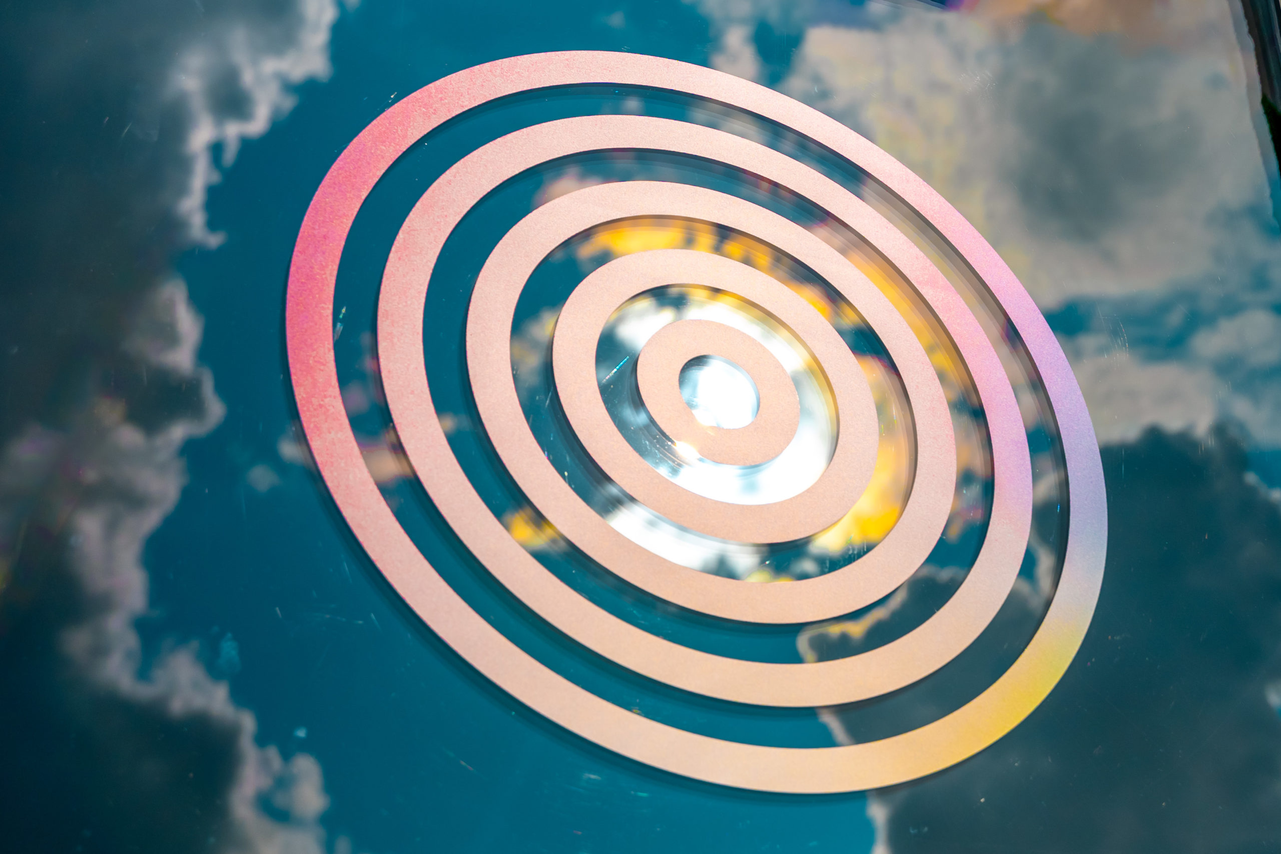
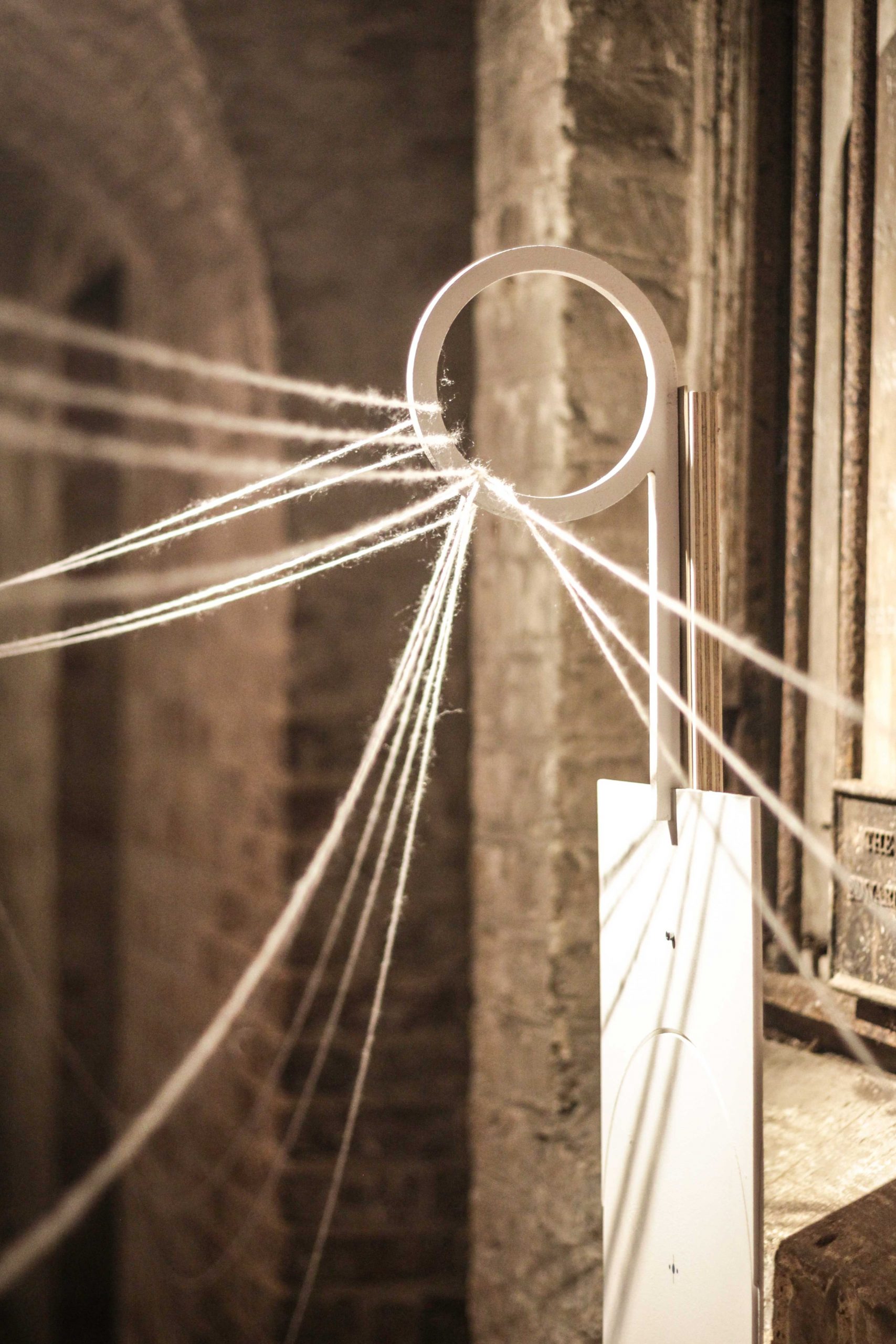
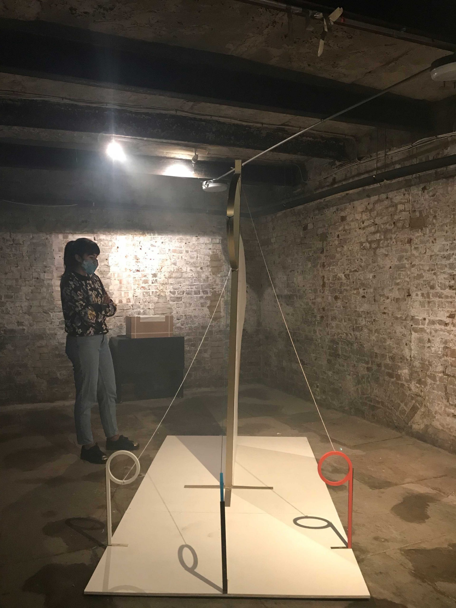
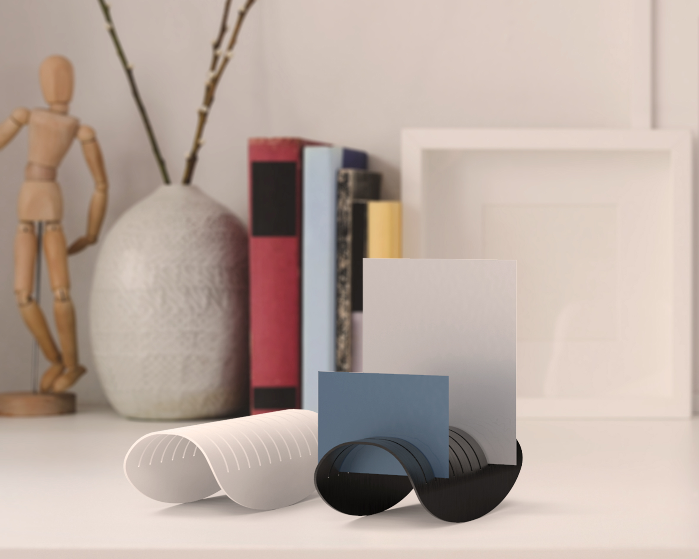
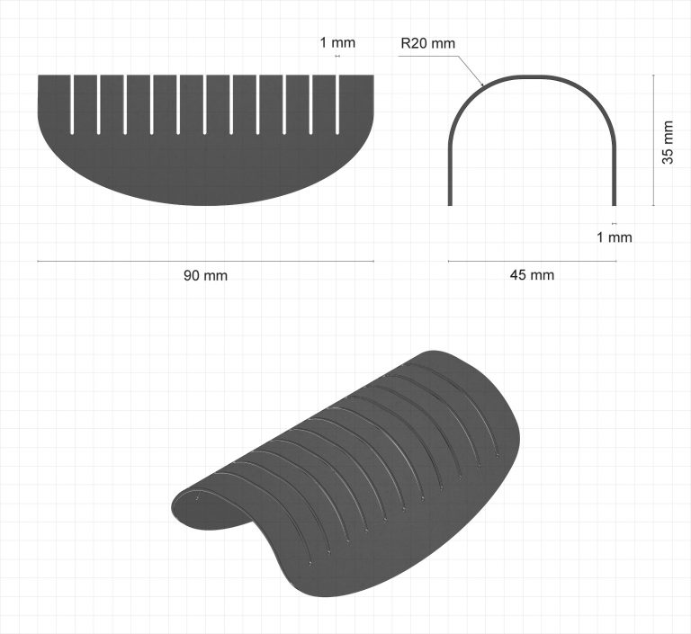
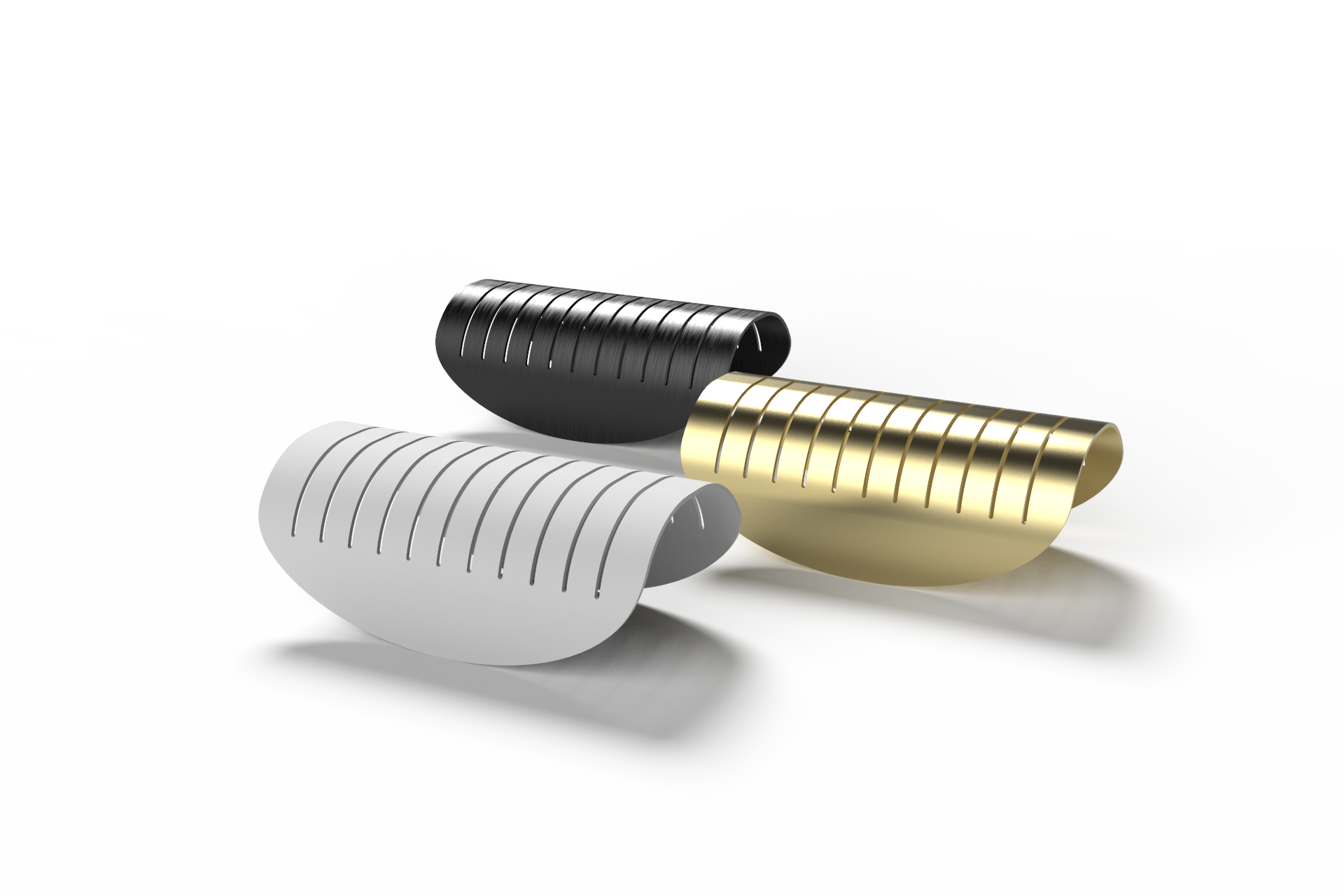
The product is made of aluminium, a sustainable material that is in line with the brand's vision. 
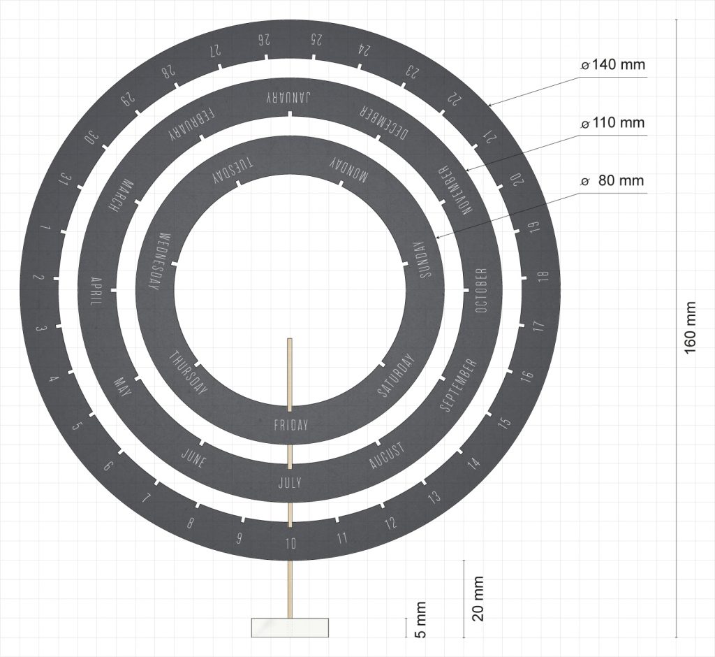
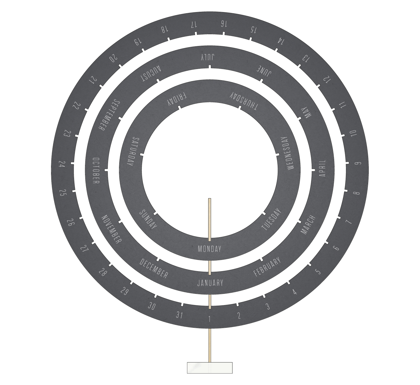
Each top is consist of a removable, laser-cut surface resting on a metal sheet. This allows to change the configuration of products displayed on each tower so as to accommodate new products introduced in the make-up collection without having to change the entire display unit.

Modular

Each tower features a category of makeup and the combination of all of them creates the complete collection. This allows the modules to be distributed according to the space available so as to adapt the display to the the retail store's needs. Moreover, since the products available in Europe do not currently correspond to the complete line available in Canada and in the US, the modularity of the display unit meets the brand's need to adapt it to the products on display.

Iconic

The display embodies the brand in both its functionality and aesthetics. The use of white and anthracite colors and of full shapes create an iconic landscape and makes it stand out from the other products in the store. Graphics that are also used on the packaging of the different products in the make up collection make the display itself communicate the brand in an immediate and effective way.

These pictures are courtesy of SAPPHO NEW PARADIGM.

MEMORABILIA

MEMORABILIAA desk organizer for your memories.

MEMORABILIA is a photo, postcard and card organizer designed to carry the most significant memories on our desk. It is named after the Latin word memorabilia that indicates the objects kept or collected because of their associations with memorable people or events. With its minimalist lines, it blends harmoniously to varied environments while the ellipsoidal swinging base gives a distinctive edge. It is made from laser-cut and bent aluminium sheet, which is fast and economical manufacturing suitable for large-scale production. Through the anodizing process, it is possible to obtain polished and diversified surface finishes to offer a wide choice to suit different tastes.

Material

One millimetre thick aluminium sheet.

Manufacturing

The aluminium sheet is first laser cut and then bent.

Finishes

Aluminium offers the possibility to obtain very refined surface finishes through anodizing.

KALPA

KALPAA desk calendar for the passing of time.

KALPA is a perpetual desk calendar that stays with us as time flows. Restoring its value with each change of the calendar, it is timeless both in essence and physicality and reconnects us to the passing of time. The user moves the discs manually as the days go by thanks to the practical insertion joint creating a daily ritual and bond with the object itself. It is named after the Sanskrit word kalpa (English aeon) that refers to the passage of time on a cosmological scale and represents eternity. The concentric circles of the design recall the imagery of the cosmos and the Hindu concept of time flowing at different scales in never-ending cycles. A kalpa lasts merely a day in the life of a Brahma but encompasses the entire cycle of the world. So too, this calendar will last a lifetime. It has minimalist lines but gives the possibility of aesthetic expression through the choice of finishes for the discs and the selection of stones for the base.

Aluminium

The aluminium discs are laser cut, then anodised and text-engraved.

Brass

The lead-free brass stand is laser cut and assembled with the base.

Stone

The stone base adds a personal detail to the calendar.