Skip to content
Portfolio
Photography
Extra
About Me
Portfolio
Photography
Extra
About Me
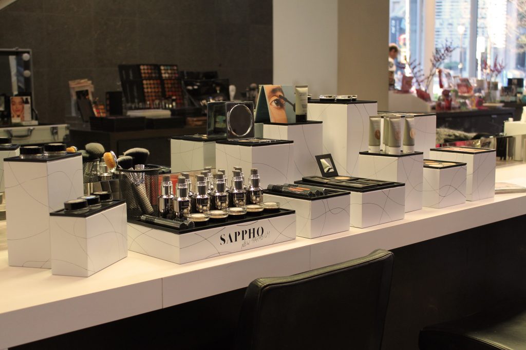
Make Up Display for SAPPHO
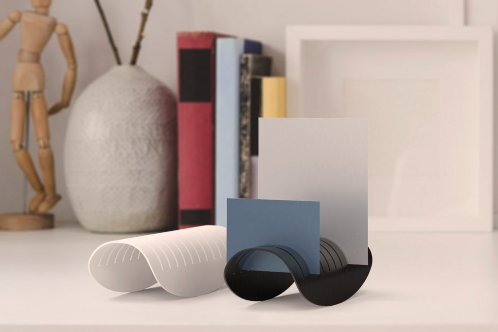
MEMORABILIA
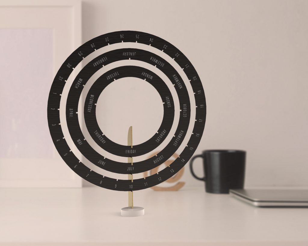
KALPA
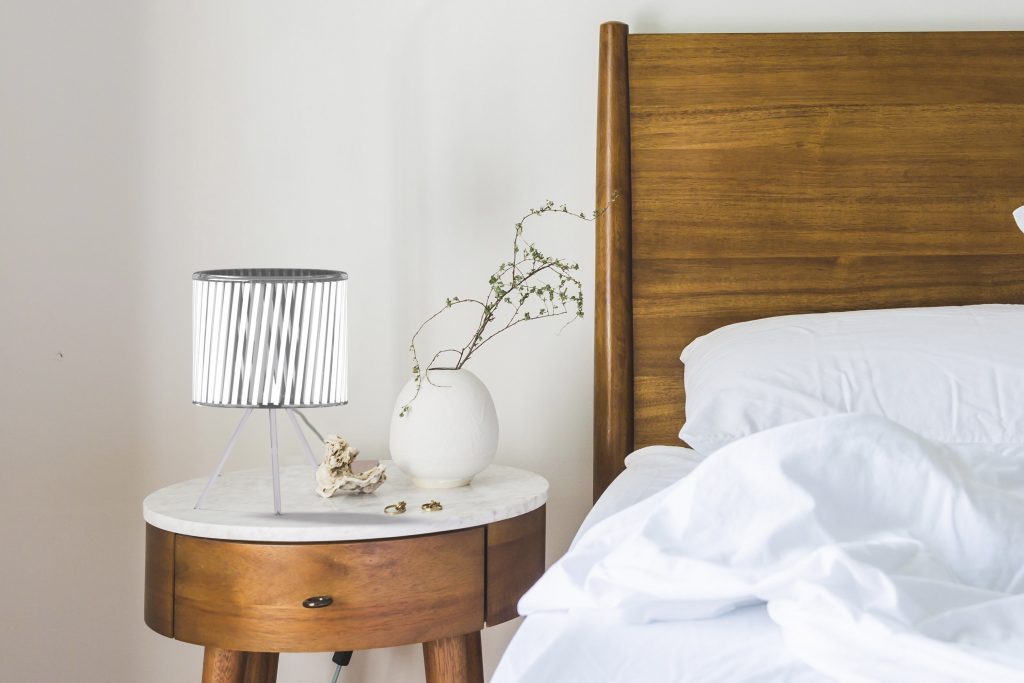
Moira
BuzziReef