Skip to content
Portfolio
Photography
Extra
About Me
Portfolio
Photography
Extra
About Me
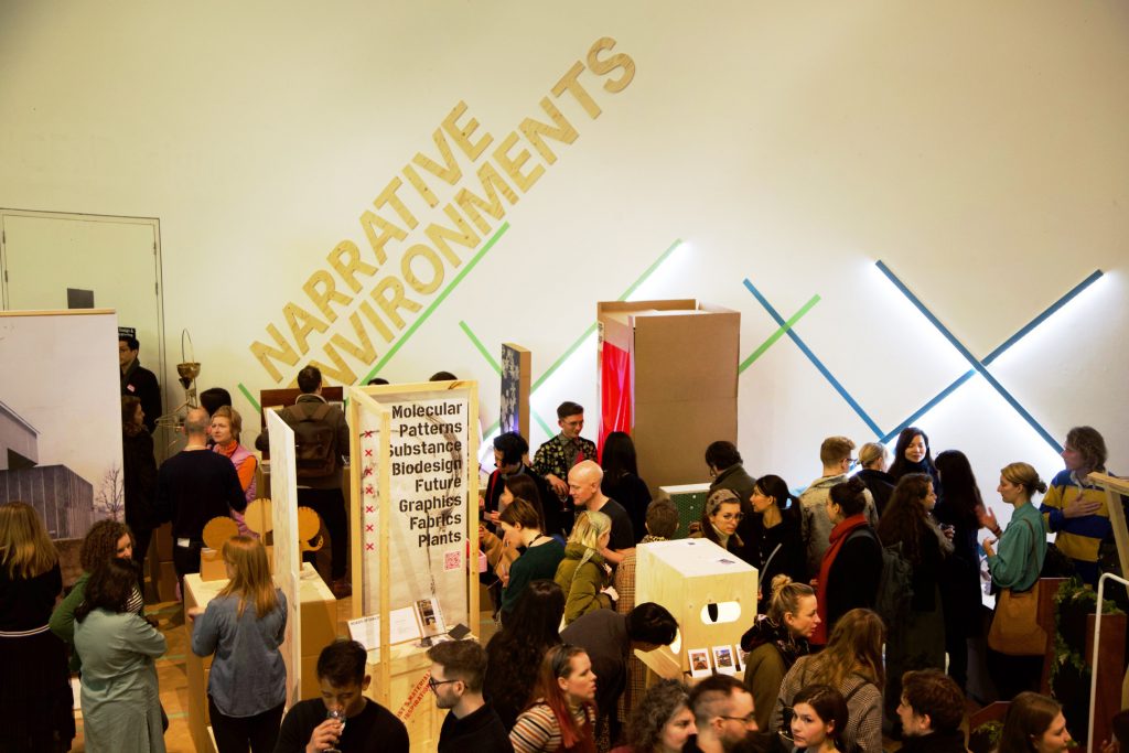
Origins Creatives
Rooting Failure
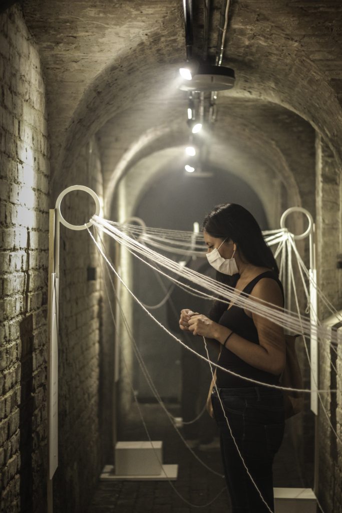
MANE Work in Progress Show 2020
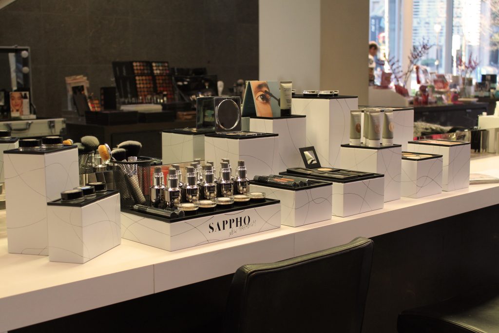
Make Up Display for SAPPHO
Unique As a Snowflake for TEZENIS
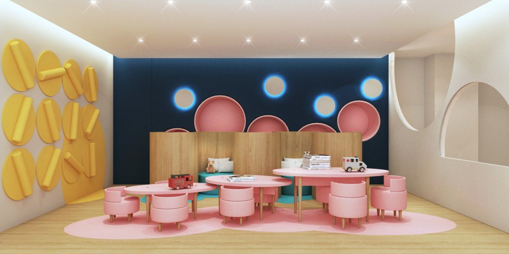
Interior Re-Design for UCLH